jixoai-ui · docs
Components — the UI-module inventory
Every registry:ui module, grouped by the antd taxonomy (General / Layout / Navigation / Layer / Data Entry / Data Display / Feedback). Non-UI registry items — the engines, the theme sheet, the file payloads — are install targets documented on the registry overview, not components.
General
ui
theme-toggle
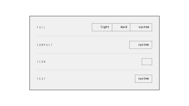
light / dark / system control in four variants: full (segmented icon+label selector), compact (icon + current), icon (icon only), text (label only). Inline SVG icons, no icon-library dependency; shared theme contract (localStorage theme, .dark + colorScheme).
ui
kbd
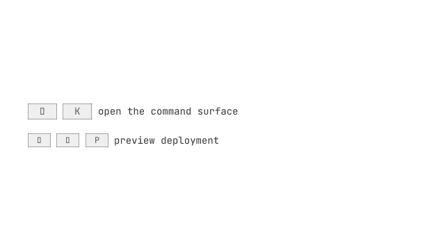
The keyboard-input glyph: a native <kbd> — the element whose entire meaning is 'this is keyboard input' — with the jixoai chip paint (1px border, shadow-2xs, mono). Deliberately no key-parsing or platform detection: compose by hand (<Kbd>⌘</Kbd> + <Kbd>K</Kbd>).
ui
inline-code
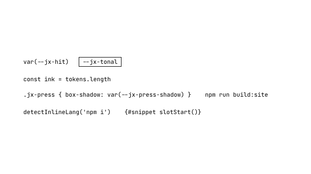
The inline source-code chip: a native <code> in the variant grammar's fused/tonal/outline ladder (fused default — the backdrop-fusion band: transparent ground + a backdrop contrast filter over whatever sits behind, auto-adaptive across themes and patterned grounds with zero color tokens; the fusion IS the frame, forced-colors repaints it CanvasText; tonal keeps the neutral [--jx-tonal:…] / jx-hue-* injection seam, consumers win from either layer). Geometry: radius rides the density ladder token --jx-chip-radius (2xs/xs/sm 2px, default 4px, lg 8px — not the global --radius), padding-inline = radius + fontSize × (lineHeight − 1) / 2 (token calc by default; explicit fontSize/lineHeight fold the excess). Highlighting rides the engine seam (backend prop → HIGHLIGHT_KEY context → the stock microlighter RANGE engine — zero markup, plain text stays copyable; a CSS.highlights pre-gate degrades to plain text silently where the API is missing, and print loses ranges by the documented freeze limitation). lang='auto' runs the zero-download fingerprint heuristic (INLINE_LANGS/detectInlineLang exported); the six text modifiers (lineHeight/weight/italic/tracking/family/fontSize) resolve through the shared @jixoai/text kernel.
ui
chip
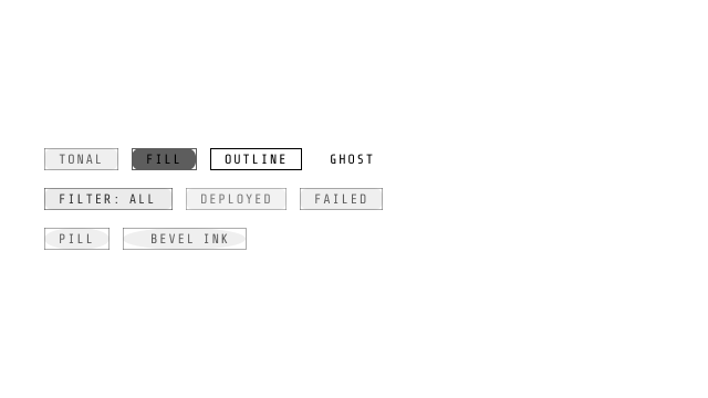
The variant grammar's compact activation: the badge's font-nav uppercase micro-label voice on the control-scale hit lane — the ROOT carries min-block-size var(--jx-hit) (~44px at default density), not a 20px badge. Four ladder rungs consumed as global tokens: fill (solid ground + same-hue border), tonal (12%/45% tint recipe, default), outline (structural border + 8% hover overlay), ghost (transparent rest, tonal hover, shadowless press); semantic hue is injected (jx-hue-error — the @utility intent layer), never named. Button/anchor duality (external hrefs open a new tab with noreferrer), slotStart/slotEnd data-icon lanes, square/pill silhouette, effect loops ride the component-tag attachment (r4 effect-attachments — the effect prop, its default ripple and the interim record retired; <Chip {@attach pressEffect(ripple())}> mounts ink on the stamped root); explicit forced-colors degradation (ButtonFace/ButtonText, Canvas/CanvasText, ghost transparent/ButtonFace hover, 2px Highlight focus never removed).
ui
link
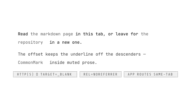
The typographic link: a native <a> carrying the prose face's non-nav lane as its own utilities (primary ink, 4px underline offset, hover underline) so it stands alone outside any jx-pure scope — and inside one the values coincide with the face's own channels (same property, same token, deterministic no-op). External detection is pattern-based, not origin-based (ANY absolute http(s) href is external; no window.location semantics dragged into SSR): external links open a new tab with rel=noreferrer (the fleet convention — doc-link and PressButton both ship bare noreferrer; modern browsers imply noopener from it). The suffix-icon lane (2026-09-07, typography-context-and-parts): tri-state icon — undefined paints the default externalLink glyph IFF external (an inline-core name answering getIcon synchronously, SSR paints it, hydration matches, no flash), null turns the lane OFF, a snippet renders custom content; the lane is an aria-hidden data-jx-link-icon span inside the anchor after the children (em-sized 0.8em, rides any ambient scale), and internal links never carry it. Hook: data-jx-link="external"|"internal" — the separator's data-orientation form. href/title and the external pair land AFTER the spread (the separator law): they are the component's contract, not overridable through rest props.
ui
text
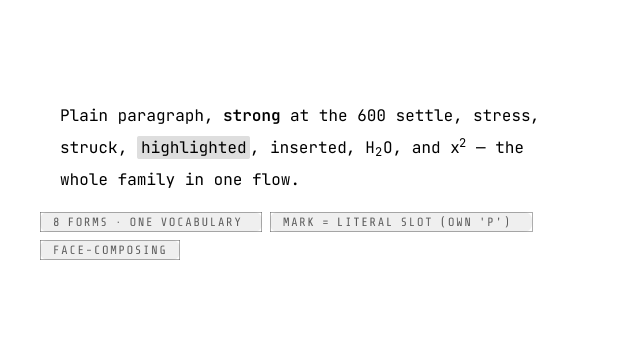
The reading-content family the Owner designed: base <Text> renders <p> by default (the Chakra <Text>-is-a-paragraph precedent) and mark switches the element and paint — ONE vocabulary where the prop value, the sugar name, and the HTML element are the same word: p (no utilities; face-composing), strong (<strong> font-semibold — the GitHub/Tailwind Typography 600 settle, a recorded override of the face's 700), em (<em> italic), del (<del> line-through), mark (<mark> highlight ground + the 0.05em/0.25em padding box mirroring the face's mark so standalone and in-face agree; forced colors drop to the Highlight pair), ins (<ins> underline), sub/sup (<sub>/<sup> — the UA baseline shift is the law). mark is a LITERAL slot (defineLiteralSlot, own 'p' — the kbd variant precedent): element vocabulary, never prominence, never zone-ambient. The eight Raw sugars (P Strong Em Del Mark Ins Sub Sup) are re-exported from the base's module script and the barrel — one vocabulary, two ergonomic forms, zero behavioral difference. FACE-COMPOSING: no member escapes no-jx-pure (an inline escape would virally descope the code chips and nested marks a link legitimately contains); the root stamps NO font-size — the ambient scale flows by inheritance.
ui
float-button
The floating action button: a fixed corner button in two idioms — plain (a lone action, e.g. back-to-top) and menu (children + actions snippet: the button toggles a popover=auto stack above it, native light dismiss). Corner is a prop, not a wrapper — the consumer's layout is never touched. Press law (.jx-press) at float scale (--shadow rest, --shadow-md hover). The menu panel rides the floating-surface law: ::after shadow layer (semi-transparent black/white) + @starting-style entry; variant='solid' | 'acrylic' | 'auto' (acrylic falls back to solid under prefers-reduced-transparency; the button itself keeps the press law).

ui
scroll-run
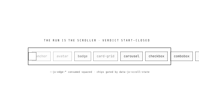
The ONE scrollable-region system (Owner 2026-09-04, the unification — tabs and button-group are the first two consumers; every future scrollable strip reuses this, never a local copy). Three parts: scroll-run.svelte.ts (createScrollStamp, the JS half — the scrollability VERDICT stamped as data-jx-scroll-state none|start-closed|end-closed|open, the single truth the css gates every overlay on; per-member --jx-edge-start/end clipped-fraction factors + host --jx-scroll-progress, RTL-normalized; ResizeObserver + visibilitychange/focus wake for background tabs; the RTL three-engine canonical [−max,0] funnel detectRtlScrollModel/rtlScrollToCanonical/rtlScrollFromCanonical (inline axis only); nudgeRun, the padding-lane-aware page step on EITHER axis; the ScrollEffect builders ramp/progressBlur/shadow, the press-button effect convention); scroll-run.css (the law sheet — the run IS the scroller: data-jx-scroll-run + data-axis degrade any strip to a hidden-scrollbar scroll run inside its host's ONE-CELL GRID; the edge factors consumed SQUARED, the eased curve — ONE member-ramp builder ramp({ opacity, blur, translate }) with every toggle default ON and a turned-off toggle never paying its css property; the frosted edge chips and the merged veil layer with its scroll-driven translate entrance; the shadow veil on the separator INK law — backdrop contrast subtracts color, never adds black; pre-hydration hides every overlay, reduced-motion kills the translate only); scroll-chrome.svelte (ScrollChrome, the DOM half of the chrome — the veil layer (progressBlur ladder or shadow bands) + the two chevron chips as real focusable buttons, wired to nudgeRun). AXIS-AWARE (round 2): the run's data-axis picks the measuring axis — a VERTICAL run measures along the block axis (scrollTop, block lane, no RTL funnel), places its chips against the block edges — horizontally CENTERED, painting the up/down glyph slots and slides its veil entrance along the block axis; the progressBlur ladder rides EITHER axis (inline edges on a horizontal run, block-edge top/bottom bands on a vertical one — the component's grid dialect). Content that cannot scroll paints NOTHING: the none verdict gates every chip, and a childList MutationObserver re-verdicts when members come or go (a shrunk strip retires its chrome). The chips are CUSTOMIZABLE two ways: css-var glyph swaps (FOUR physical direction slots --jx-scroll-chevron-left/-right/-up/-down, each independently swappable; the run axis + the chip edge + page direction pick the slot, RTL swapping the inline pair) or backwardContent/forwardContent snippet children rendered INSIDE the frosted buttons (the frost, gating and focusable-button law stay; the glyph layer retires and the content centers in the chip). The chips sit IN-BOARD by default — flush against the edge they serve, centered on the cross axis, every placement rule zero-specificity so a consumer override re-places them; hover RAISES a chip (Owner round 10): the frost paints --jx-scroll-chevron-chip-hover (near-opaque) and the lift deepens (the transition carries only the hover pair — the scroll-driven fade never animates). The ramp magnitudes are CHROME-OWNED: ScrollChrome stamps --jx-scroll-edge-slide/blur on the run from the builder's distance/radius (a toggle off never sets its var — consumers never hand-write them). Either chip can be DECLARED disabled (backwardDisabled/forwardDisabled, default rendered): a disabled chip does not render AT ALL — no DOM node, no paint, no a11y entry (consumer-declared absence; the verdict stays the automatic gate for rendered chips). Consumers keep ONLY their tuning: their own band widths, snap, mirrors onto companion elements (tabs mirrors the factors onto its indicator so the bar rides its active trigger).
ui
icon
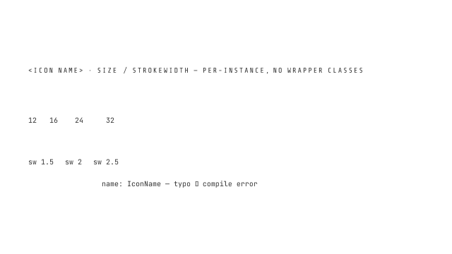
The named-glyph renderer over the generated icon-set: <Icon name="chevronRight" /> paints 16px currentColor artwork with a typo-proof IconName union (a wrong name is a compile error). The component owns the <svg> root (viewBox from the data, square size edge, caps/joins by artwork nature, aria-hidden, data-jx-icon); class + rest props land on the root verbatim; size and strokeWidth are props, never wrapper CSS. Inline-core names render synchronously (SSR paints them, hydration matches, zero wiring); names past the chunk budget ride loadIcon() into a FIXED reserved box — pending and rejected render the identical span so hydration never rewrites it, and a failed chunk warns once per session.
ui
icon-button
The icon+text button with an explicit two-part contract: icon is the glyph (ALWAYS decorative — wrapped aria-hidden), text is the ONE label (a single string, single-sourced). Two postures: text (icon + label side by side) and iconOnly (a square on the same 42px band as a text button — the label moves to the tooltip and stays the accessible name via aria-label; an icon-only button must say itself). Composed ON press-button: every paint variant and the component-tag effect attachment ({@attach pressEffect(…)} chains through this component's rest spread into press-button's own, landing at the wrapped button's stamped root), href/external anchoring and the press law pass through verbatim.
ui
progressive-blur
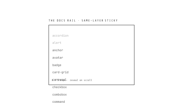
The scroll-edge blur atom (Magic UI port, 2026-08-25): stacked masked backdrop-filter bands ramp blur from clear at the inner edge to the full stack at the scrollport edge — content scrolling under its OWN container's edge diffuses instead of slicing. The overlay root is a sticky h-0 pin (zero layout impact, glued to the scrollport edge; abspos-in-scroller scrolls away), so the whole component is markup + css, zero JS. jixoai extension: reveal='scroll' fades the ladder in with the CSS scroll timeline (nothing blurs at rest) — @supports-gated, degrading to no effect. pin='grid' (2026-09-01): a position-free dialect for one-cell grid hosts (start/end/inline positions, gradients aim physically, documented LTR) with a hold option (the outer share of the band, %, that keeps the ladder's peak instead of ramping — for strips whose readable content parks inboard of a control lane). Grid-dialect paint law (empirical, Chromium 152): the band painted after the scroller and a no-op translateZ(0) compositor isolation per band — without these a veil at the scroll-origin edge samples a dead backdrop and only the first band after the scroller paints; the ladder layers themselves stay pure grid items of the band.
ui
button-group
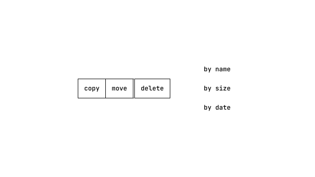
Joined action layout container: orientation/justify shell that presses edge-to-edge press-buttons (and icon-buttons) over the hairline seam law — adjacent children collapse borders via a -1px margin so a joined row of outline buttons reads as ONE control with 1px seams, never a 2px double border. The container owns NOTHING but layout and seam: buttons keep their own paint (variant ladder, press physics, density tier); the group paints no bezel. role=group with a required label (grouping of related actions, never a selection surface — joined selection is toggle-group). A joined row is fundamentally a CONTAINER, so it owns the overflow question (Owner 2026-09-04): overflow='wrap' (default, multi-row flow with the seam law per row), overflow='collapse' (measured collapse into a dropdown tail — buttons that no longer fit re-home into an overflow menu, dividers fence the tail), or overflow='scroll' (a hidden-scrollbar scroll run on the shared @jixoai/scroll-run system — data-jx-scroll-run IS the group root, the JS-stamped verdict gates the frosted edge chips, and scrollEffect picks the edge treatment via the same builder convention as tabs: ramp() the ONE member-ramp builder ({ opacity, blur, translate } toggles, all default on), progressBlur()/shadow() the veil pair — and the chrome is AXIS-AWARE: a vertical scroll group rides the same contract against its block edges).
ui
math-inline
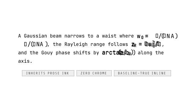
The inline math surface: ONE native <span> carrying real KaTeX markup rendered SYNCHRONOUSLY — the isomorphic-small SSR lane (prerender bakes the formula itself: no plain-text floor, no hydration work, no flash; a tex prop change re-derives live). No chrome, no controls; the span inherits prose currentColor — light/dark inverts with ZERO re-render. role="math" sits on the content-only span with katex's hidden MathML as the screen-reader path (no aria-label shadowing); consumer attributes spread through first — data-testid/title/aria-*/handlers land untouched while the component's semantic stamps win their own fields.
Terminal
ui
terminal-header
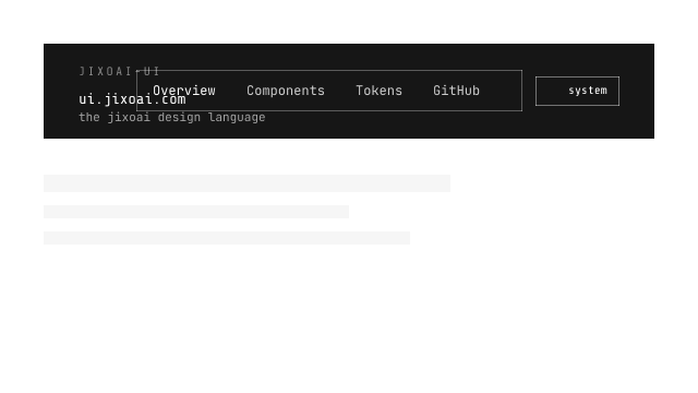
The site header as composed chrome: the bar shell, brand block, pill box with its sliding indicator, and the mobile drawer — the NAVIGATION is composed NavigationMenuItem/Trigger/Panel parts (consumer-authored mega grids) with bare NavigationMenuLinks; the three-level TerminalNavItem config tree is dead. closeAll() hides every open popover under the header; open is bindable for the drawer.
ui
terminal-footer
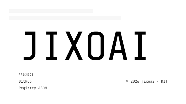
The site footer as composed chrome: TerminalFooter owns the © row + ghost fallback; TerminalFooterColumn (title + free link children) composes the columns.
ui
ghostty-term
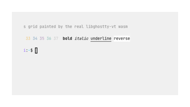
The brand's live terminal surface: a DPR-aware canvas grid rendered by the real libghostty-vt wasm with rAF-batched dirty-row painting, density-derived cell metrics (--jx-text/--jx-line), auto (ResizeObserver) or explicit cols/rows sizing, and the onData input bridge (keyEncode, paste-gated, wheel scroll). Shell paper/ink resolve from jixoai terminal tokens; ANSI/256/truecolor content colors pass through verbatim. wasm url comes from the virtual:jixoai-ghostty plugin module or the wasmUrl prop; load failure degrades to data-state=error with a terminal-styled fallback (children slot owns the face).
ui
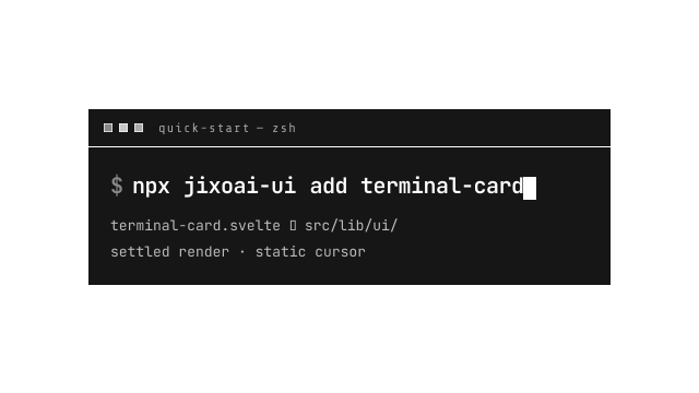
terminal-card
The Broadside hero terminal, composed after the openspecui reference: traffic-light title bar, one large typed command line, outputs surfacing line by line, 6px hard offset shadow. One-shot typing entrance (never looping), static block cursor (jixoai motion law), prerendered/no-JS shows the settled terminal, reduced motion renders instantly.
Layout
ui
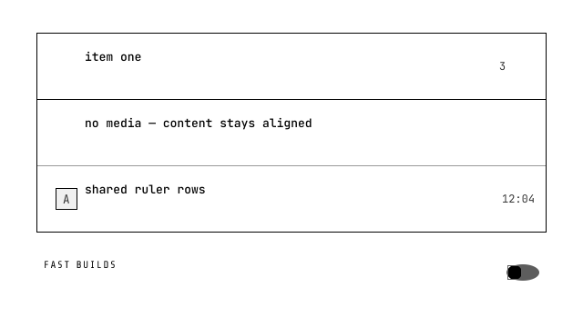
list-item
The list row as a system (F7 coverage, shadcn composition): AUTO-VARIANT chrome — standalone rows carry their own terminal surface, ItemGroup owns the frame (native section+ul, default/muted/plain modes, optional label, divider policy: 38% auto hairlines structurally exclusive with full-strength ItemDivider). The ItemEnd lane hosts after/actions/chevron; the grid presence matrix stays four bits (:has()-driven, no implicit tracks). ItemField wires settings rows (label[for], describedby chains, icon glyph inline-start of the label) and seven thin adapters — ItemToggle / ItemCheckbox / ItemRadio / ItemSelect / ItemInput / ItemSegmented / ItemStepper — compose the existing controls without reimplementing them (segmented rides native radio ToggleGroup semantics, stepper rides NumberInput with typing first-class). layout=media rides custom properties; narrow groups wrap the end lane at 30rem via container query.
ui
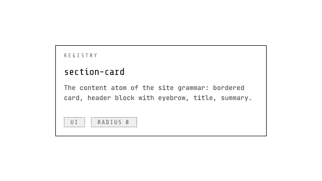
section-card
The content atom of the jixoai site grammar: bordered card, header block with eyebrow (brand hue, Share Tech Mono, tracked), font-nav title, text-pretty summary, body snippet slot.
ui
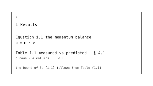
figure
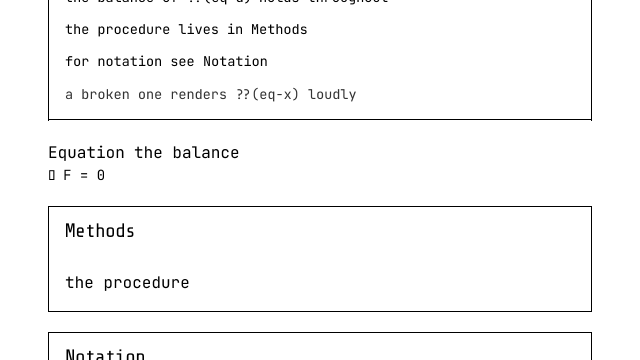
The ontology's 浮 line primitive: a native <figure> that numbers itself from its Section's numbering domain — chapter-scoped per kind (Eq 4.5) or document-continuous by floatScope declaration. The wrapper owns structure (number/anchor/caption, the display currency of DOM order — reorder renumbers); any point nests inside as the content slot (composition-first: the line carries structure, the point carries industry semantics). citedIn is the manual backlink lane (display-currency strings rendered verbatim + emitted as JSON) while automatic backlink rendering stays a documented harvest-only gap. The family folder also ships the frozen R2 interface module (numbering.svelte.ts: TargetRegistry, NumberingDomain/DomainRegistry, the pure ordinal derivation) and the route-page NumberingProvider that owns the document-level observer lifecycle.
ui
reference
The ontology's 引 primitive: a typed cross-link with zero grammar knowledge of its own — resolution follows the target through the route-page document registry (an equation Figure renders Eq (4.5), a numbered Section § 3.2.1, an unnumbered one its title). The resolved state is a native fragment anchor (keyboard/ARIA ride the platform); a missing target degrades loudly to a visible ??(id) marker that never throws. Edge emission splits by state: not-yet-registered (the whole SSR pass) keeps the data-ref-to claim for the static harvester's two-pass pre-scan, while a settled miss drops the edge (dead anchors are a filed bug class). The children snippet replaces the anchor's label text only.
ui
website-scaffold
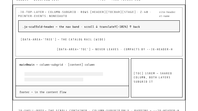
WebsiteScaffold — the page scaffold for presentation sites (traditional websites) around terminal-header: a sticky, always-visible header band (navigation never scrolls away), main column, optional footer, and a skip link. Ships the systematized MPA view transitions: cross-document navigation with a persistent site-header and a horizontal-slide + blur crossfade on page-main (reduced-motion degrades to crossfade). Pair with view-transitions-toolkit's useAutoTypes() (render-blocking) for from-/to-route typed variants. Renamed from app-shell: an AppScaffold for application-style sites is a separate future design.
ui
hero-section
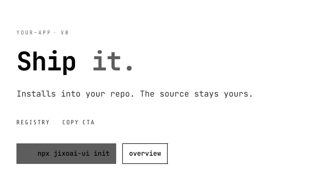
The landing hero with opened content: title/badges/terminal/secondary/copy are snippets (the caller composes Badge children; the default copy CTA rides the copyCommand payload; the em accent paint lives in family css).
ui
card-grid
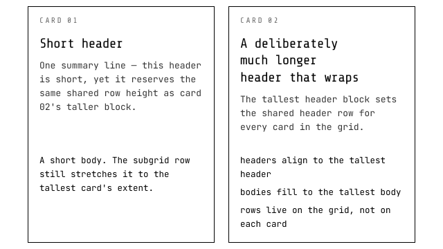
Grid + subgrid layout that equalizes cards: shared header row and body row, so headers align and bodies fill to the tallest — no ragged tops or unequal bottoms. Columns are auto-fit minmax (responsive; min prop controls collapse width, default 320px). The foot prop declares a third shared row so zone-trio cards (head/body/foot, e.g. the card component) also align their feet at band bottoms. Works with any card whose first child is the header block (section-card unchanged); no-subgrid browsers fall back to stacked rows.
ui
card
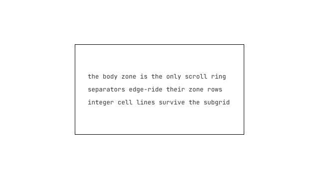
The structural surface — the dialog row ruler's static clone: head/body/foot zones with stamped presence, edge-riding structural separators, the body-only scroll law, and an open inline-end actions slot (no close button ships). Zones place by integer cell lines, so the card qualifies as a card-grid child unchanged. Designed as the foundation dialog will sit on.
ui
scaffold-float
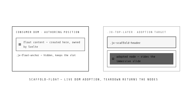
The consumer-side half of the WebsiteScaffold float provider: renders children into the scaffold's top layer (.jx-top-layer) through a real portal — nodes are created here (full Svelte ownership) and adopted into the provider's insertion point on mount. The float rides the top layer's immersive hide/reveal with the header by construction.
ui
prototype-kit
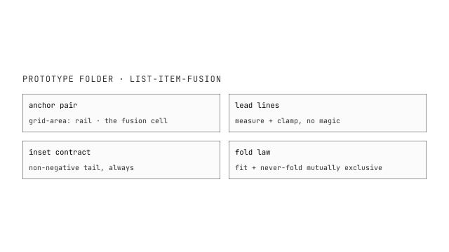
The prototype standard's three declarative frame components (design-studio): PrototypeCanvas — a CSS grid container (gridCols/gridRows/gap; number → repeat(N, minmax(0,1fr)), string verbatim, omitted → adaptive auto-fill wrap) that nests freely and provides the prototype-folder context to its frames (explicit prop ?? inherited canvas ?? derived from the /prototypes/<name>/ canvas-page URL); PrototypePage — a declarative viewport iframe whose src is the design server's frame surface, /__design__/frame?p=<prototype>&f=<ref minus leading ./>&theme=<light|dark|auto>&w=<px>&h=<px> (real media/container queries follow the frame viewport; width overflow scales visually, the real viewport is never faked); PrototypeComponent — the same frame with adaptive content height (height is the initial value until same-origin measurement takes over; fill locks it — the URL carries &fill=0|1). Frame ids are DOM anchors (unique per canvas, dev warning on conflict, first wins). Outside a design-server host the frames render a visible "requires the design server" notice instead of a dead iframe.
ui
separator
W3C-first: the horizontal separator IS the native <hr> (thematic break semantics for free); only the vertical posture takes the ARIA route (<div role=separator>). No color, only physics: the default variant is fused — a backdrop-filter contrast ghost that self-adapts to any background (the ink law); geometry variants (dashed/dense/dotted/wavy) are masks over that strip, the fade variant rides a blend-mode gradient, and solid is the plain-fill var(--border) escape (the subtraction-ink exception, Owner amendment 2026-09-08).
ui
stack
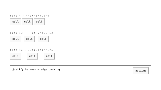
The Layout family's FLOW primitive: one-dimensional arrangement (row/column) over the site's typed space ladder — every gap is a --jx-space-N rung (token-bound stylex atoms, 16 rungs 2..80), the axis vocabulary is the closed CSS set (align start/center/end/baseline/stretch; justify start/center/end/between/stretch). A Stack paints NOTHING else — layout only. Props are structural (never-ambient; no Defaults contract — outside the context gate's paint vocabulary by classification).
ui
grid
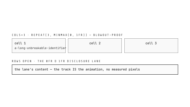
The Layout family's GRID primitive: two-dimensional track arrangement over the typed space ladder. Numeric cols compile to the blowout-proof repeat(N, minmax(0, 1fr)) atom (the grid-law vocabulary); the rows lane carries the DISCLOSURE vocabulary (collapse = 0fr, open = 1fr — the 0fr-to-1fr collapse every drawer rides; grid-template-rows animates, height:auto never does). Bespoke track forms stay in surface modules — an open string domain cannot be pre-atomized.
ui
boot-splash
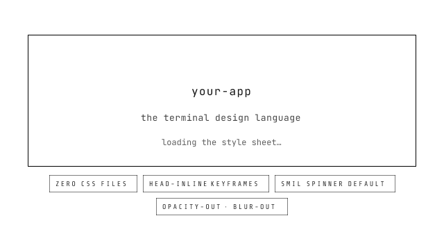
The FOUC mask (Owner design, 2026-09-19): a splash layer whose styles CANNOT be late — every style rides the HTML itself (inline style attributes + a <style> block carried inside <svelte:head>, which SSR renders INLINE into the document — never an async chunk). It paints before any stylesheet and masks the unstyled window (async css delivery, the dev lane's JS-fetcher stylex css, slow-network waterfalls, late fonts). Slots: logo, loading (default: a hardcoded SMIL SVG spinner — zero css by construction; compose a spin-pack loader here), title, subtitle, description (progress or time-consuming copy). Exit vocabulary: opacity-out | blur-out | none (keyframes in the same head block; reduced-motion skips; a <noscript> rule never traps the page). Dismissal: revealOn fonts | load | manual, with a timeoutMs cap and a minMs display floor. website-scaffold carries the splash seat at its host root.
ui
scroll-area
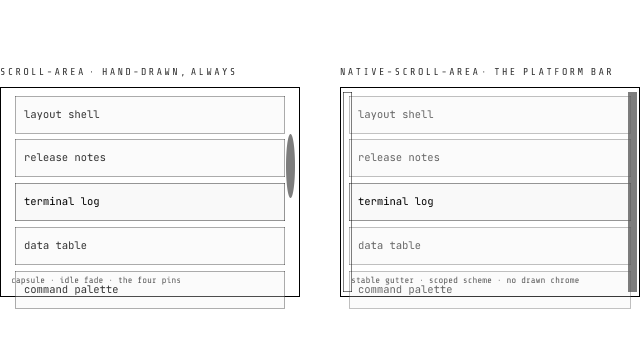
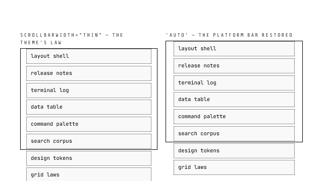
The dedicated scrollable-region component (Owner request, 2026-08-22, after shadcnui — but W3C-first nativeHTML), REWORKED 2026-09-15 (Owner ruling): the component IS a native scroll container — wheel, touch momentum, keyboard, PageUp/Home, scroll-snap and overscroll chaining stay platform behavior — and the scrollbar is ALWAYS HAND-DRAWN (the standing dual-mode scrollbar prop and its ScrollbarVariant type retired; no mode branch exists, breaking). Square-cut thumb (radius 0 by default; `radius` prop — px or 'full' for the capsule opt-in) on the scrollbar-token law (currentColor family — themes/dark stages restyle without JS), width tiers (`width` prop: thin/auto/wide — track 8/12/16, thumb resting 6/10/14 = track − 2), a track FLUSH to the region edge with the thumb's edge-side flank AT the edge itself (the 2px resting inset on the START side, Owner r3), hover growth to the full track strictly INTO the content (the inset-carried transform-origin: right center law; RTL mirrors), idle fade (~700ms) with FOUR testable auto-hide pins (region focus-within, thumb focus, active drag, hover — each suspends the fade; while any pin holds the thumb stays in the accessibility tree with aria-valuenow tracking), hover widens + brightens, drag pins the active tone, keyboard affordances on region AND thumb (role=scrollbar, keyboard-draggable), track-click paging, both axes, RTL. The platform path is its own sibling item (native-scroll-area); both share the scroll-area-kit lib kernel — this component consumes the hand-drawn interaction adapter over the shared core. Floors: fitted content draws nothing (the none verdict), coarse pointers keep the platform bar, no-JS output keeps the platform bar (hydration upgrades), reduced-motion keeps the chrome statically visible. Instance exports (bind:this): getViewport() / scrollTo().
ui
native-scroll-area
The scroll-area family's PLATFORM sibling (Owner ruling, 2026-09-15: do NOT split native vs non-native inside one component — the styled component hand-draws always; this item ships the platform path). Zero drawn chrome: the platform scrollbar under the site's scrollbar-token law (the theme's global currentColor chain paints it) with the native best practices packaged as CAPABILITY STYLES from the scroll-area-kit kernel: scrollbar-gutter stable both-edges on vertical-capable axes (overflow arriving never shifts layout), color-scheme aligned with the STAGE SCOPE not just the OS (the nearest [data-theme]/.dark/.jx-light resolves and re-resolves live through a class+data-theme observer on the ancestor chain — the fill-channel lesson applied to the platform bar), scrollbar-width tiers auto|thin|none (the theme's thin law is the default), overscroll-behavior containment. NO custom scrollbar ARIA mounts anywhere inside — no drawn thumb exists and the platform scrollbar IS the accessibility contract (probe-asserted absent). The region keeps the WAI scrollable-region pattern (role=region + name + tabindex). Instance exports (bind:this): getViewport() / scrollTo().
ui
pattern-login
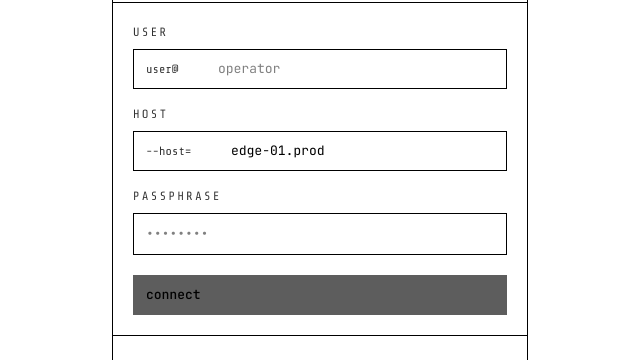
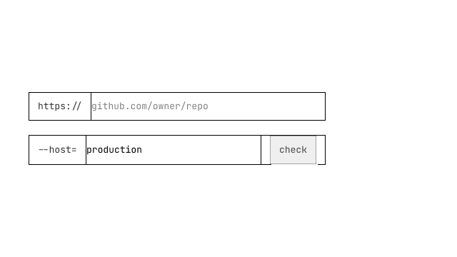
The `ssh user@host` login card — a composition product, not a primitive: user/host lanes are plain Input (innerInlineStart carries the user@ / --host= glyphs), the passphrase reveal rides the Input's own eye (hard F1 prerequisite — no pattern-local fallback), the OTP second-factor screen rides input-otp (joined form value; incomplete codes submit empty), the submit is a PressButton, and the footer is the copyable npx bootstrap line — the terminal idiom's magic-link analog.
ui
pattern-pricing
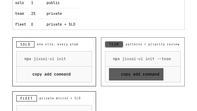
The `$ plan --compare` section: the comparison matrix rides the Table family (consumer authors thead/tbody; the recommended column opts in with data-jx-recommended on the th AND its td's — pattern css paints brand inset rules that keep the row-hover law intact), each tier's install command rides a CodeCard with a copy PressButton in its footer, plan labels ride Badge. Commands/labels are value-domain payload; no atom is patched.
ui
pattern-hero-set
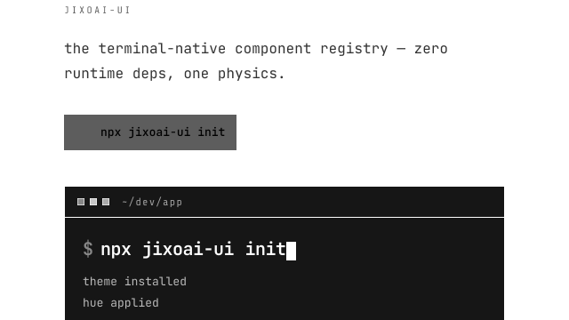
Three hero forms of the terminal grammar: the terminal-window hero (hero-section with the right column prewired to a terminal-card whose command derives from copyCommand — one string drives the CTA label, the clipboard payload and the typed demo), the ASCII-art headline hero (art as whitespace-preserved payload in a pre under the mono scale law — wide banners scroll, ascii never reflows), and the badge-marquee hero (plain mono token strip with an aria-hidden duplicate on a seamless -50% CSS loop; prefers-reduced-motion kills the animation, folds the duplicate away and leaves a static scrollable row).
ui
pattern-faq
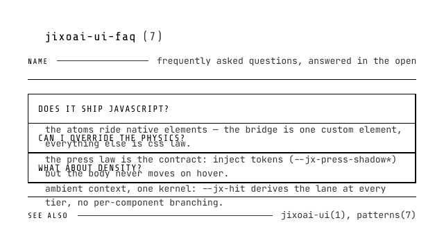
The man-page FAQ: a command(section) head with the print-style dotted NAME leader over the accordion family (native details/summary — exclusive by default, questions compose as AccordionItem children or bare details), closing on a SEE ALSO line. The pattern owns only the framing; disclosure semantics, keyboard and SSR state belong to the accordion.
ui
pattern-cta
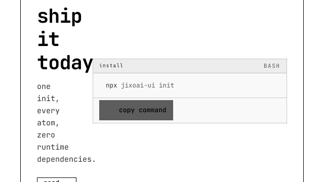
The shell-prompt CTA band: a lead block (eyebrow / heading / summary / optional outline escape) beside the install command on a CodeCard (copyable=false — the band owns exactly ONE copy affordance) with the copy PressButton in the card's footer: fill rung, copy → check flip, 1.4s copied surface. Press physics stay the button's own.
ui
prototype-flex
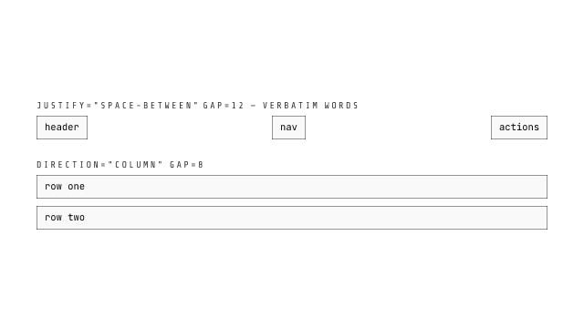
The layout family, ALPHA TRACK (design-studio r2 §6): the standardized flex primitive the design studio's property panel edits live. Single-root + rest-spread — the stamp mechanism's family precondition. direction/wrap/align/justify are native CSS tokens passed through 1:1 (no vocabulary mapping); gap number → px; an omitted prop injects no declaration. Inline style only: zero Tailwind, zero tokens, zero dependencies — renders in any host.
ui
prototype-grid
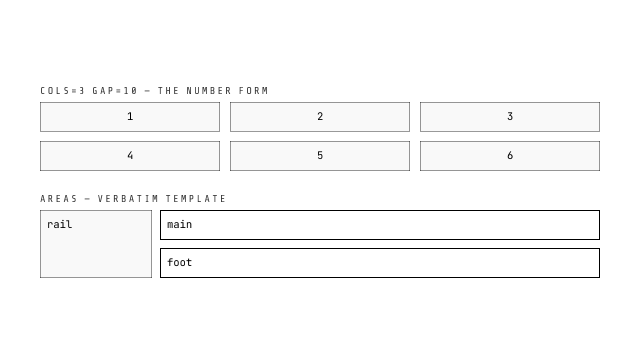
The layout family, ALPHA TRACK (design-studio r2 §6): the standardized grid primitive the design studio's property panel edits live. Single-root + rest-spread — the stamp mechanism's family precondition. cols/rows: number → repeat(N, minmax(0,1fr)) (the blowout-proof track form), string verbatim; areas verbatim; gap number → px; omitted props inject nothing. Inline style only: zero Tailwind, zero tokens, zero dependencies — renders in any host.
ui
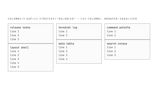
prototype-waterfall
The layout family, ALPHA TRACK (design-studio r2 §6): the standardized waterfall primitive the design studio's property panel edits live — CSS multi-column under the hood (children flow in newspaper column order, not shortest-column-first; break-inside stays the consumer's call; strategy 'balanced' = column-fill balance, v0's only strategy). Single-root + rest-spread — the stamp mechanism's family precondition; columns rides the CSS columns shorthand verbatim; gap number → px; omitted props inject nothing. Inline style only: zero Tailwind, zero tokens, zero dependencies — renders in any host.
Navigation
ui
toc
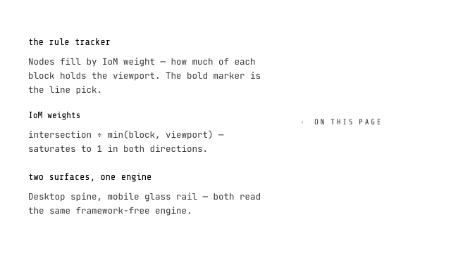
The reading rail as a composed family: manual mode composes TocList/TocItem/TocLink(child) — a legal list tree (anchors never nest); AUTO mode (outline: TocOutlineConfig) derives from headings at runtime — the DECLARED SSR exception (rail shell first, links on hydrate). Scrollspy is Root behavior, DOM-delegated.
ui
language-switcher
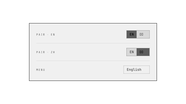
Locale switching in two variants: pair (icon + segmented two-locale group, active fills brand hue — composed after the openspecui bilingual reference) and menu (icon + current-locale button with a hard-shadow dropdown for three or more locales). Anchor-based (each locale carries its href) so it works on fully prerendered sites; terminal-surface styling matches theme-toggle.
ui
tabs
WAI-ARIA APG tabs with the INDICATOR ENGINE (2026-09-01): a single shared element measured to the active trigger and animated between positions (240ms, reduced-motion-safe, ResizeObserver re-fits without animating). Materials: line (default, 2px primary), pill (tonal fill), outline (segmented), glass (backdrop-filter frosted), liquid (SVG displacement — liquid glass where the engine supports backdrop-filter url(), glass otherwise), none — or a snippet override that owns the paint while the engine owns geometry. Trigger anatomy (Material grammar): text, icon / iconEnd snippet lanes (slot-vs-padding law), icon-only (aria-label), stack (icon over label). Layouts: inline / grow (equal widths) / scroll (hidden-scrollbar overflow strip) / wrap (multi-row flow, the line bar underlining each row's own tab), composable with any material; every horizontal strip auto-degrades to a scroll run (the tablist IS the scroller) on the SHARED @jixoai/scroll-run system (Owner 2026-09-04 unification — one law set for every scrollable region): the JS-stamped verdict gates the on-demand DOM chevron chips outside the tablist, swappable css-var glyphs, smooth proximity-snap travel; the edge treatment is the scrollEffect builder prop, the press-button effect convention — ramp() the ONE member-ramp builder ({ opacity, blur, translate } toggles, all default on, a toggle off never paying its property; ramp({ blur: false }) the cheapest posture) ramping each trigger by its clipped fraction at the edges (scroll-following JS-stamped factors, consumed squared, every engine; the machine also MIRRORS the factors onto the indicator so the bar rides its active trigger out), progressBlur({ blurLevels, width }) veiling the edges with the progressive-blur ladder, shadow({ width }) as the single-layer contrast ghost — backdrop-filter contrast() subtracts color toward mid tone (light grounds dim, dark grounds lift, never a black overlay; the separator ink law); both veils share the merged clip layer and enter by scroll-driven translate) when content outgrows the container; vertical axis throughout. Automatic or manual activation, roving tabindex, deterministic id pairing, hidden background panels.

ui
pagination
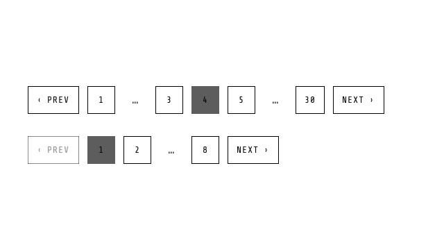
The pager as composed shadcn parts (Content/Item/Link(child)/Previous/Next/Ellipsis) over the exported pure pageRange helper (token law: number | ellipsis-start | ellipsis-end). The window math is headless; the links are the consumer tree. At the bounds Previous/Next become honest disabled spans.
ui
dropdown-menu
The ARIA menu pattern on the popover laws: popover=auto panel (light dismiss, Escape, top layer native) + CSS Anchor Positioning, roving item focus, type-ahead. Floating-surface law: ::after shadow layer + @starting-style entry; variant solid|acrylic|auto.
ui
breadcrumb
The breadcrumb as composed shadcn anatomy: List/Item/Link(child)/Page/Separator(children glyph override)/Ellipsis parts. Collapse is an OPT-IN part (BreadcrumbCollapse wraps the middle items; its ellipsis links to the first hidden page). Dropdown is the sibling-jump part (BreadcrumbDropdown: click opens a menu of peer destinations — REAL anchor entries, current page marked, selection dismisses and navigates). No width magic in Root.

ui
navigation-menu
The site-nav bar as a composed family riding the Popover primitive: declarative popovertarget wire, light dismiss, one-at-a-time; Item/Trigger/Panel/Link parts; the mega-grid is authored INSIDE the panel by the consumer. Viewport/Indicator are recorded divergences (per-panel CSS anchoring replaces the Radix shared viewport). OPTIONAL NavigationMenuIndicator part: the sliding-active indicator with two motion laws — motion="navigation" stamps a view-transition-name for page-level View Transition morphs (inert without transitions; same-document moves animate via WAAPI), motion="waapi" is the pure Web Animations path for apps without View Transitions.
ui
menubar
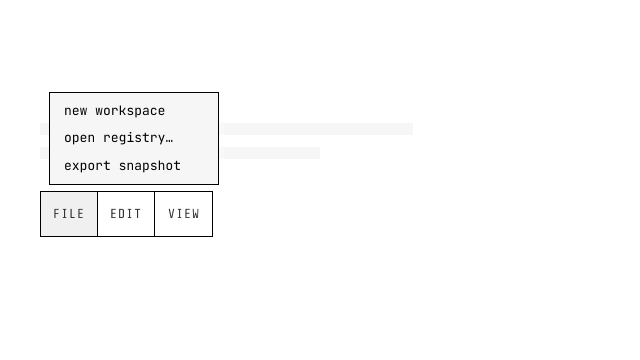
The application menu bar as a composed family (Radix Menubar shape): Item owns the id + anchor (Trigger/Panel derive their ids — the ID derivation protocol), Panel is a popover=manual role=menu registering handles at init; ←/→ glide, ↓/↑/Enter open, per-panel motion kernels, DOM-scoped panel walks (nested menus never leak); MenubarMenuItem closes-and-restores on select.
ui
steps
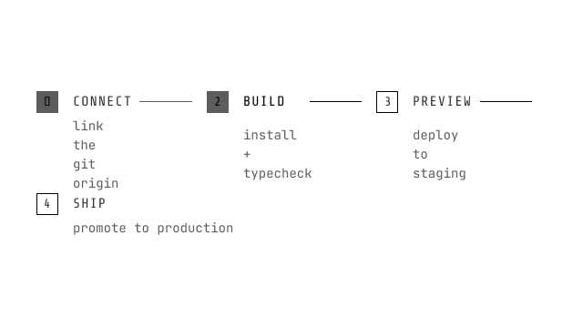
The wizard progress as a composed family: a nine-word state vocabulary (auto trio + middle pending, success/error/hint/emphasis/disabled) overrides the derived done/current/todo comparison when stated explicitly. The done Indicator becomes the button (a link back) when onclick is given; the current step is aria-current=step; future steps are inert spans. CSS connector; check glyph on done; the Separator self-hides on the last item.
ui
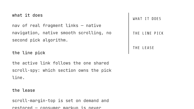
anchor
The in-page rail as a composed family: AnchorItem children are the targets (DOM-delegated scrollspy — no registration); the pick paints aria-current=location; offset drives the sticky-header pick line; capture-phase scroll listening covers inner scrollers.
Layer
ui
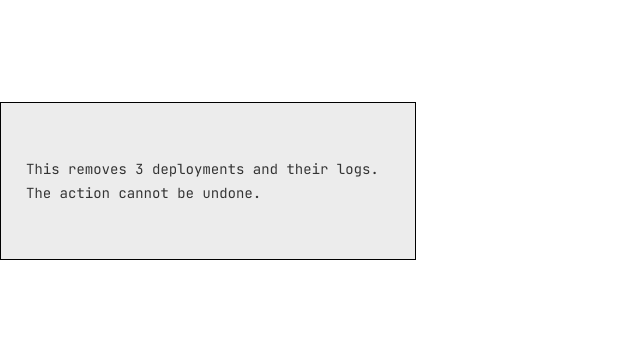
dialog
NativeHTML dialog: native <dialog> + showModal() (focus trap, Escape, top layer). Floating-surface law: ::after shadow layer + @starting-style pull-apart entry; variant='solid' | 'acrylic' | 'auto'; scrim = --scrim (semi-transparent black/white, never a brand tint); the 460ms WAAPI --jx-p timeline presses the layers back together.
ui
popover
NativeHTML popover: the native Popover API base (popover='auto' light dismiss, popovertarget trigger, CSS Anchor Positioning). Floating-surface law: the hard offset shadow is a REAL ::after layer pulled apart by an @starting-style entry; variant='solid' | 'acrylic' (dual backdrop-filter: surface blur + shadow-layer brightness) | 'auto' (acrylic unless prefers-reduced-transparency). Transparent ::backdrop; caret flips via :has(+ :popover-open).
ui
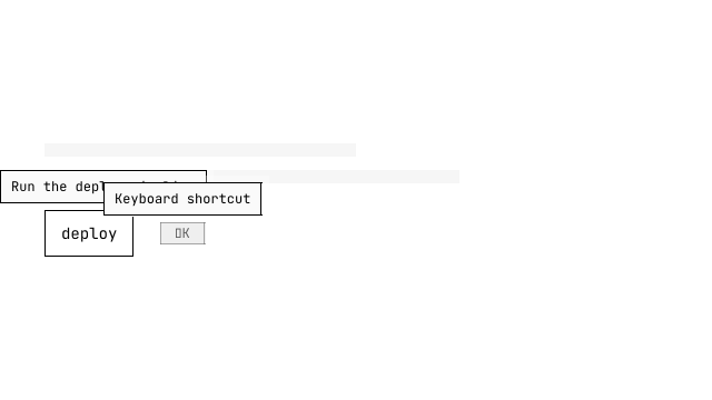
tooltip
The hover-intent hint on the popover laws: popover=manual panel (no light dismiss), delay-in/cancellable close grace, CSS anchoring. Shadowless BY LAW (the ::after layer is content:none) but rides the jx-surface entry choreography and the variant paints (solid|acrylic|auto).
ui
toast
Two seams, per the design ruling: createToastStore() (framework-free state + lifecycle — push/dismiss/subscribe, per-toast expiry with hover/focus pause, duration 0 = sticky, no module singleton so SSR stays clean; variant grammar: variant 'outline'|'tonal' + the hue-injection seam, e.g. class 'jx-hue-error' for failed statuses (the @utility intent layer)) and ToastViewport (mount once in the root layout: fixed corner stack, max visible with older queued, per-item live regions — role=status polite / role=alert assertive, dismiss buttons, entry/exit frames; the ladder paints over the floating popover ground with explicit forced-colors degradation).

ui
system-dialog
The confirmation dialog as a composed family (shadcn-shaped on the native <dialog>): Root (bind:open/onconfirm) + Trigger / Content / Title / Description / Actions / Action(variant: fill with the destructive pair injected by default | tonal | outline) / Cancel — focus lands on Cancel (the safe default), Escape cancels, confirm runs then closes. No Overlay/Portal parts (the dialog element IS the overlay) — recorded divergence.

ui
sheet
The side drawer as a dialog POSITIONING variant (not a second state machine): showModal(), side docking + slide along the docked axis, generation-token close. Floating-surface law: ::after shadow layer + variant solid|acrylic|auto riding on top of the slide; --scrim backdrop; the slide keeps the sheet's own 200ms timing (declared exception to the 120ms dialog default).
ui
hover-card
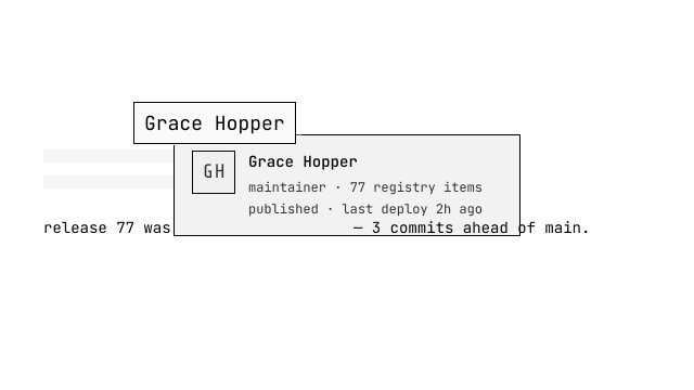
The rich interactive cousin of tooltip: popover=manual panel, close grace spans the panel, CSS anchoring. Floating-surface law: ::after shadow layer + @starting-style entry; variant solid|acrylic|auto.
ui
command
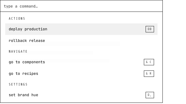
The command palette as a composed cmdk-style family: Input/List/Empty/Group/Item parts; items SELF-MATCH ({label, keywords} vs query through the match inclusion predicate — filtering hides, NEVER reorders; authored tree order is the walk order). hint is a snippet (kbd glyph content); disabled items render but never enter the walk, never become activedescendant, never fire on Enter. Groups self-hide and the empty state reveals via CSS :has.
ui
popconfirm
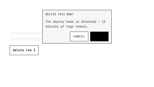
The light confirm bubble (NOT an alertdialog): trigger = children; panel content/actions open via content/actions snippets with the current rendering as defaults. Light dismiss = cancel.
ui
tour
The spotlight tour: steps carry targets (behavior domain, driver.js precedent); the card opens via the card(api) snippet ({index, total, step, next, prev, skip}) with the zero-config default card when absent. Spotlight, focus and step lifecycle unchanged.
Data Entry
ui
input
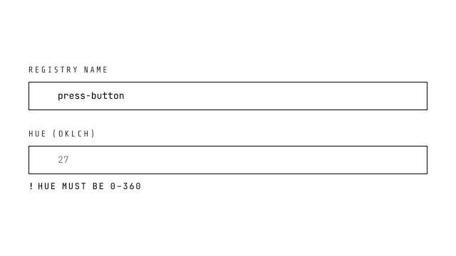
NativeHTML input: every native type passes through. Text-like types get the jixoai shell (1px border, radius 0, hover lift, inset focus ring) with the Tier-1 lane (.jx-input-lane) inside; range is the Tier-1 pure-CSS slider (.jx-range); color is the Tier-1 color field (.jx-color-field wrapper, locked square swatch, pipette glyph); date/time/number lanes restyle the platform's picker indicator and spinners via the same sheet. checkbox/radio/toggle/file have their own components (the bare types still pass through). Optional label[for], error wiring (aria-invalid + aria-describedby, monochrome dashed ! message), clearable ×, four snippet slots. value is $bindable: bound = controlled, absent = purely uncontrolled (FormData/form.reset untouched).
ui
select
Custom select built on the native Popover API + CSS Anchor Positioning: popover='auto' light-dismiss panel, listbox role with roving aria-activedescendant (↑↓/Home/End/Enter), terminal bezel styling with primary left-border selected state, RTL-aware. name= submits the committed VALUE into FormData through the faceless form-field bridge (ElementInternals); for the platform's own overlay picker use native-select instead. Floating-surface law: ::after shadow layer (semi-transparent black/white) + @starting-style entry; variant='solid' | 'acrylic' | 'auto' (acrylic falls back to solid under prefers-reduced-transparency; the terminal bezel keeps its identity through the jx-surface fill props).
ui
textarea
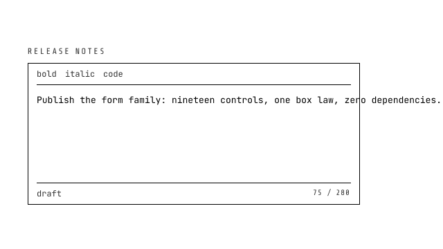
NativeHTML textarea with the jixoai text shell; rows pass-through (default 4), resize: vertical. Same label/error contract as input.
ui
checkbox
Pure-CSS checkbox: appearance-none + 16px square + 1px border, :checked fills primary with a white checkmark (clip-path polygon, zero icon deps), :indeterminate morphs to a horizontal bar, error wiring (aria-invalid + describedby + dashed border + monochrome ! message). Label on inline-start.
ui
radio
Pure-CSS radio: appearance-none + 16px circle, :checked border primary + inner 8px dot (scale 0→1 transition), error wiring identical to checkbox.
ui
toggle
Native checkbox painted as a switch: ONE element — the input is the rail (the standard layer's jx-html-switch utility draws the capsule and its ::before knob). Rail geometry rides the density lanes (xs 32×16 · sm 36×18 · default 40×20 · lg 48×24); checked slides the knob by width − track and flips it to primary-foreground over 200ms cubic-bezier; checked = $bindable; the label renders as a sibling label[for].
ui
native-select
The original native <select> with appearance-none and self-drawn chevron — recommended for simple forms, mobile native overlay picker, and FormData submission. Multiple mode with listbox geometry.
ui
number-input
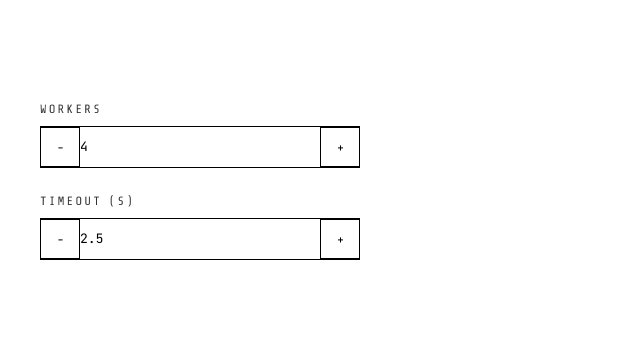
[- NUM +] stepper: 28px square buttons (press physics, font-nav bold characters), centered chromeless input on the Tier-1 .jx-input-lane (placeholder distinction + spinner law live in the jx-pure sheet (Part A)), click + long-press (300ms→100ms) acceleration, min/max clamp, RTL-aware logical properties.
ui
range
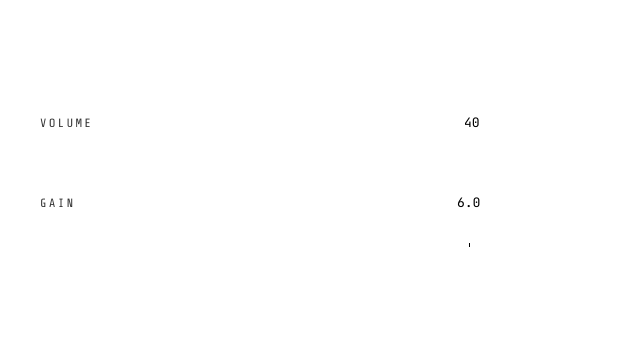
The native slider, semantic surface: a REAL input[type=range] as the base (2026-09-01 native rebase — jx-pure is the foundation; the registry version adds slots and semantics, never re-draws the control). The platform owns pointer, keyboard (arrows/Home/End/PageUp/Down), RTL, the label[for] binding and form submission (name= rides the input own FormData lane); the component adds the label row, the step-precision value readout, the optional tick ruler (one mark per step, inset to the thumb's travel; click a mark to snap, the wheel fine-tunes one input-step per detent behind a declarative touch-action axis grammar (wheel: true | 'x' | 'y' | 'xy' | 'none' | { x?, y? } with per-detent multipliers — owned gestures are swallowed and default-prevented, the page never scrolls under the slider), the ruler composes declaratively through RangeTick scales (marks at scale × step periods, lengths grading ascending by value), the vertical orientation face (orient attribute + writing-mode: min at the physical bottom, geometry on the width axis, the ruler maps bottom-up), the family error law (aria-invalid + aria-describedby + dashed-ring thumb), density tiers and external-write snapping. Paint is the jx-pure range recipe verbatim on the component hook — one visual law, two mounting surfaces.
ui
date-picker
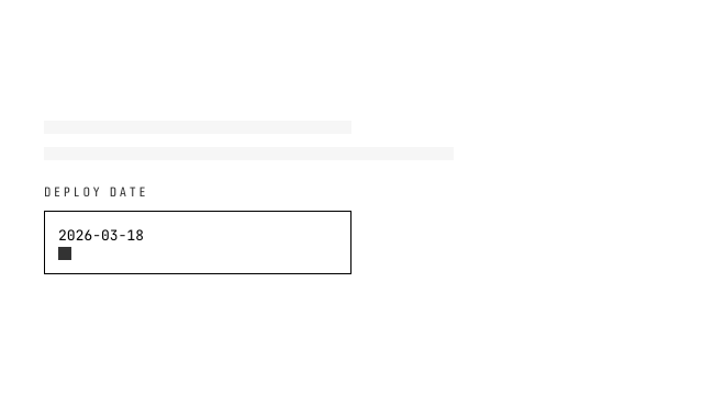
Form wave 2 — calendar popover over hand-rolled Date math (zero date libraries): single ISO string or {start,end} range with anchor/swap semantics, Monday-first grid, strict ISO parse/format/compare. Popover API panel (popover=auto + popovertarget) CSS-anchored under a select-style trigger; light dismiss/Escape/top-layer are native. Floating-surface law: ::after shadow layer (semi-transparent black/white) + @starting-style entry; variant='solid' | 'acrylic' | 'auto' (acrylic falls back to solid under prefers-reduced-transparency; the terminal bezel keeps its identity through the jx-surface fill props).
ui
file-input
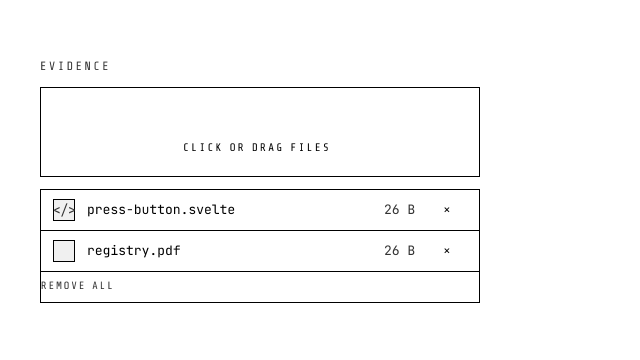
The file picker that reads like one (2026-08-23 redesign, ant-design Upload anatomy with local-picker semantics): drop (default) renders a dashed drop zone — upload glyph, font-nav CLICK OR DRAG FILES, composed accept/max hint, drag-over swaps the dash to primary with lift physics — button renders the compact inline trigger; both are keyboard buttons over a visually hidden native input AND real drop targets (enter-depth counting, accept gate-rejection reported via the error line + onreject). Selected files render as ant-style rows in one bordered box: square thumb (image object-URL preview or kind glyph), ellipsized name + title, size, remove ×, remove-all tail. File[] $bindable contract, sm/md/lg sizing, maxFiles overflow merged into the error line (never truncates), InputGroup overflow hardening (min-width 0, max-width 100%).
ui
color-picker
Color picking on NATIVE controls (2026-09-01 rebase — jx-pure is the foundation; the registry surface adds slots and semantics, never re-drawn inputs): the value field is a real input[type=text] (label[for], name= rides its own FormData lane, native focus/selection/disabled) and the swatch is a real input[type=color] that opens the engine picker; the chevron opens the pro popover editor — SV pad + hue bar (custom 2D picker surfaces, the legitimacy class of date-picker's calendar), hex/hsl/oklch switching with OKLCH as the conversion hub, invalid-draft revert, Eye Dropper API. One truth: every surface flows through the bindable value string.
ui
combobox
Searchable select with custom-value input: real-time label filtering, allowCustom for free-text values, popover panel with roving aria-activedescendant (focus stays in input), 'No results' + 'Use xxx' affordance, blur-commit, family label/error contract. name= is intercepted off the native input and submits the committed VALUE (option value or custom string — never the display label) through the faceless form-field bridge. Floating-surface law: ::after shadow layer (semi-transparent black/white) + @starting-style entry; variant='solid' | 'acrylic' | 'auto' (acrylic falls back to solid under prefers-reduced-transparency; the terminal bezel keeps its identity through the jx-surface fill props).
ui
tags-input
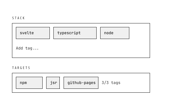
Input + multiselect hybrid: flex-wrap tag chips with press-physics removal, Enter/comma/Tab/paste-split to add, Backspace removes last, suggestions popover with filtering, maxTags limit, duplicate flash, $bindable Tag[]. name= submits the tag VALUES as one JSON array string (empty set contributes nothing) through the faceless form-field bridge. Floating-surface law: ::after shadow layer (semi-transparent black/white) + @starting-style entry; variant='solid' | 'acrylic' | 'auto' (acrylic falls back to solid under prefers-reduced-transparency; the terminal bezel keeps its identity through the jx-surface fill props).
ui
input-otp
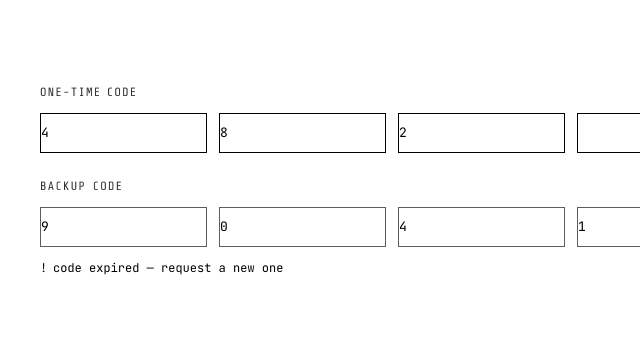
The one-time-code field: N single-character inputs with the mechanics a raw stack lacks — auto-advance, backstep on backspace, paste distributing across slots, focus landing on the first empty slot (entering from outside only). Submits ONE joined value through the jx-form-field ElementInternals bridge (partial codes submit empty, never a partial lie).
ui
toggle-group
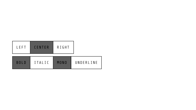
The joined segment row of NATIVE inputs: single = label>input[type=radio] under one name (native arrow-walk + one tab stop + exclusivity; re-press does NOT clear — an explicit none item is the pattern), multiple = checkboxes submitting one FormData entry per press (getAll on the server). DOM checked is the uncontrolled truth; value is the projection; form.reset() re-syncs. The paint law is the shared Part A .jx-tgroup class from @jixoai/jx-native-contract (never redefined here); the jx-form-field bridge is retired for this family.
ui
transfer
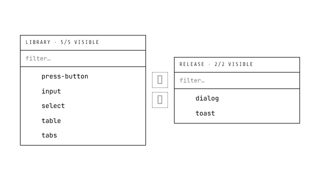
The two-panel selector: each side is a real fieldset of real checkboxes (native multi-select semantics), the middle buttons batch-move every checked row, and per-panel search filters by label. value ($bindable) is the TARGET list — moving never mutates options; selection is transient and clears after each move; disabled rows render but never move.
ui
cascader
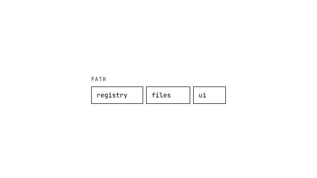
The cascade selector, chain-of-selects route (the ruled default): N plain <select> elements, each listing the children of the previous pick — native option semantics, native keyboard, native mobile pickers, zero panels. The joined PATH submits through the jx-form-field bridge (separator '/', default); a partial path submits '' (the input-otp law). The antd multi-column search panel is the documented upgrade route.
ui
input-group
The joined field shell — ONE 1px var(--border) bezel, the var(--background) fill, hover lift, inset focus ring and invalid dashed border ride the SAME paint as the shared html-control-shell law (state machines in input-group.css keyed on the data-jx-igroup hook). A composition frame, not a closed composite: InputGroupAddon lanes (hairline seams per addon edge — no double borders by construction), InputGroupInput as the native input member, press-buttons ride the inline-end addon. disabled on the ROOT disables the whole group natively (InputGroupInput renders disabled, every addon renders inert — the platform's containment).
Data Display
ui
code-card
Code display highlighting through its single default engine Shiki (lib/shiki — shiki/core + the JavaScript regex engine, no WASM): on-demand grammars and themes as separate lazy chunks, the default zero-download jixoai theme is Shiki's css-variables recipe bound to the --tok-* palette. figure+pre+code base, filename tab + header snippet slot, footer snippet slot, copyable control. Scroll law: pre is the scrollport — horizontal always (tabs stay tabs), vertical when maxHeight caps it, thin scrollbars, overscroll containment, keyboard-focusable. Code is a runtime prop; Shiki escapes it, so literal </script> is inert. Engine matrix (2026-09-06): the default install carries ONLY shiki — additional engines install as their own items (highlight-prismjs / -microlighter / -highlightjs / -sugar-high / -tree-sitter); backend prop → context default → stock shiki resolution unchanged. Language detection (highlight-lang-detector, 2026-09-07): lang='auto' (the AUTO_LANG sentinel, STRICT equality — 'AUTO'/' auto ' are ordinary langs) runs the three-ring chain langDetector prop → HIGHLIGHT_DETECT_KEY context → backend.detector, null cascades complementing, a reject terminal (plain-text fallback + warn); detection bytes load only when a card actually enters auto — a bare install carries ZERO detector code (the DLD waterfall is the highlight-lang-detector item, its wrapper highlight-detect-default).
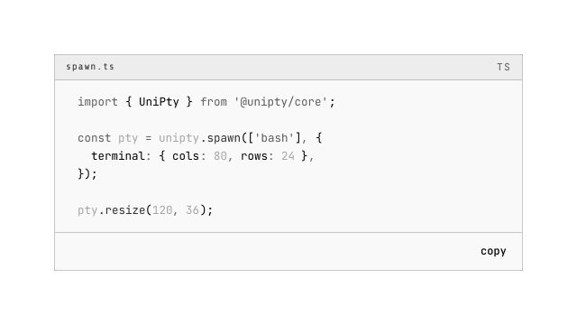
ui
table
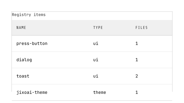
NativeHTML table with jixoai styling, driven by container queries on its own frame (not the viewport): full semantic thead/tbody/tfoot/th/td preserved; figure wrapper with overflow-x auto. Wide frame (>=30rem): scroll law with fit-content columns and opt-in pinned columns (data-sticky="start"|"end" on th+td stick to the scrollport behind a hairline fold mark). Narrow frame: CodePen card mode — thead folds away, td[data-label] renders muted label ::before with the value flushed right, first cell becomes the card head; stack=false keeps the scroll law at every width. Every paint routes through the --jx-table-* local token surface (surface/head/hover/hairline/rule/edge) with theme-token defaults — hover carries the --brand-hue flow, one var overrides per instance.
ui
markdown
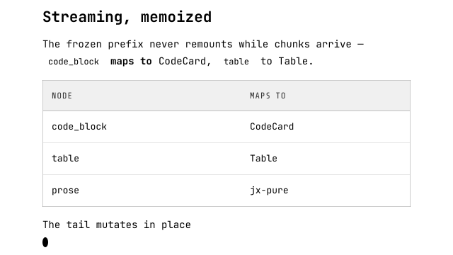
Markdown rendering with append-only streaming (stream-markdown-parser core — markdown-it-ts under it, CommonMark + GFM; the renderer owns the DOM, never the parser's): one keyed block per top-level AST node (${index}:${type}:${digest}; the streaming tail keys on type alone), so the frozen prefix never remounts while chunks arrive — prefix keys freeze, the tail mutates in place, remounts stay bounded to one per semantic event, and the stream's end re-parses once with final semantics. The AST maps onto first-party registry parts: blockquote → Blockquote with GitHub alert detection first (a [!NOTE|TIP|IMPORTANT|WARNING|CAUTION] marker on the quote's own first line renders tonal + label + the status hue; a half-typed marker simply renders the plain quote — the shadow-1 rule default, since 2026-09-07 every quote's left rule is an inset shadow — and keeps updating in place), heading → Heading (the em ladder migrated out of the face sheet so it scales with the ambient preset), list → List (children recurse; list_item stays a native li), paragraph → P and inline marks → the text family (Strong/Em/Del/Mark/Ins/Sub/Sup — one word is prop value, sugar name, and HTML element), link → Link (absolute http(s) opens externally), inline_code → InlineCode riding the component's lang='auto' default (detection is sync fingerprints, zero-download; the grammar highlight is the async in-place upgrade through the engine seam — SSR plain, zero layout shift), thematic_break → Separator behind a neutral carrier div, code_block → CodeCard (partial code + loading state mid-fence, generation-guard repaint is CodeCard's own path), table → a semantically neutral div[data-kind=table] wrapping Table with generated thead/tbody, td[data-label] row labels and per-column align. Box-owning block roots escape the jx-pure Tier-0 prose face (no-jx-pure on Blockquote/Heading/List roots and the InlineCode chip, Separator's carrier div) so the face stops double-painting them; face-composing inline members never escape (P, the marks, Link — an inline escape would virally descope the code chips and nested marks a link legitimately contains). Task checkboxes stay native disabled inputs (the jx-pure bare-checkbox face paints them); image stays the sanitized native img. The root mounts the face class; the sheet itself is the app-level import, imported once from the site css the way jixoai.css is — never a forked copy of the face laws, never a second component-level import that would double-bundle it. Security floor: html:false + the renderer's escaped-literal law (raw markup survives as text, zero {@html} in the default map), the factory validateLink demotes unsafe schemes at parse time, image src passes the bitmap-data-URL sanitizer (SVG and other data schemes omit the img entirely). The components override seam is trusted application code — the same trust level as any component the app renders by hand. The component is a pure function of (source, streaming): server render and client hydration parse the same snapshot (the SSR snapshot law); data-jx-markdown-streaming + the terminal cursor stamp the root only while streaming. HTML is markdown spelled differently (2026-09-07): whitelisted tags (<b>, <strong>, <details>/<summary>, <code>, <kbd>, <a>, <hr>…) route onto the SAME components as their markdown spellings; every other tag stays escaped literal text.
ui
blockquote
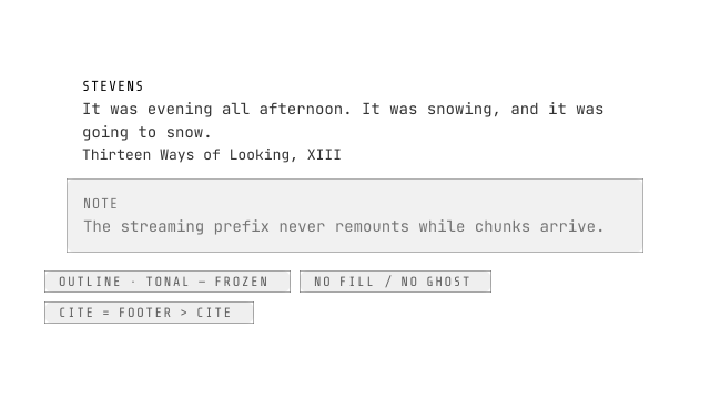
The reading-content quote/admonition surface: the semantic body IS the native <blockquote> (cite renders the MDN attribution posture — footer > cite — never an element swap), on the alert-shaped two-rung ladder: outline (own) transparent ground + 1px left rule + muted body (the classic GitHub/Tailwind quote), tonal the alert tonal recipe verbatim (12% tinted ground, 45% border, rounded box — the callout/Notion posture). The rule channel (2026-09-07, typography-context-and-parts): rule (shadow|border, own shadow — the inset standard the Owner cited: command-item's shadow-[inset_2px_0_0_var(--primary)], the elevation grammar's WELL tier, kbd's --shadow-engrave lineage) × ruleSize (the literal 1|4|8 px ladder, own 1 — the Owner's explicit enumeration, not a derived scale); the rule color rides the rung's OWN border-color declaration (one hue source — jx-hue-* retunes ground+box+rule together), ONE shadow utility per root, outline in shadow mode emits no border at all (the shadow carries the rule), tonal keeps its box border plus the shadow rule so tonal+shadow-1 is a deliberate near-no-op (axis uniformity over special-casing), and the paddings stay FIXED across channels and sizes (border consumes geometry, shadow doesn't — paint never moves geometry). Forced colors: shadow modes re-materialize as an Npx CanvasText border; border modes keep the rung degradation. Availability is FROZEN at two rungs: quote readability excludes fill AND ghost — ghost is interactive-chrome vocabulary (rest-transparent, hover-tonal) which a static quote misuses; the borderless manuscript indent is a future STRUCTURAL axis, never a paint rung. label renders the alert title-row form, icon lands inline-start of it (bring your own glyph), hue rides injection through jx-hue-* class utilities (the markdown map's GitHub alerts land here as tonal + label + hue). The root stamps NO font-size — the ambient scale flows by inheritance (the typography trio law); the markdown default map mounts it with no-jx-pure (the box-owning block escape).
ui
heading
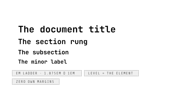
The level-laddered heading: a native h1–h6 by level (1–6, rounded then clamped — the rendered truth is what the hook stamps), carrying the em size ladder migrated out of the markdown face sheet (1.875em h1 → 1.5em → 1.25em → 1.125em → 1em/1em) so the hierarchy scales with the ambient font-size preset AND the component stands alone. Level IS the structural axis — no paint ladder (the separator precedent of a literal-axis-only component); font-bold, leading-[1.25], foreground ink are what it owns. NO block margins (preflight zeroes them; the container rhythm law owns root spacing). Default level 2: h1 is the page's one-per-page title — a component defaulting to it would mint competing titles.
ui
list
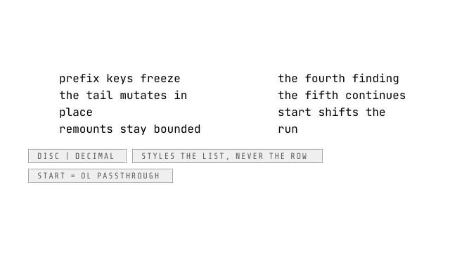
The prose list: a native <ol|ul> by ordered (the separator's dual-root cast — Props typed on the ul shape, start passed explicitly on the ol branch only). Owns the reading channels: list-style disc|decimal, padding-inline-start 1.5rem, muted marker ink; NO block margins (the rhythm/flush laws own spacing). The marker vocabulary (2026-09-07, typography-context-and-parts): marker disc|circle|square|decimal|alpha|roman|none — element-agnostic frozen set, lowercase only (upper = the escape hatch); omitted keeps the per-element platform default (decimal on ol, disc on ul — today's byte-parity), explicit overrides, and circle/square ride the arbitrary [list-style:] form (they silently no-op as core utilities under TW 4.2.1); marker ink stays the muted law, marker size/spacing deliberately absent (ambient scale + the no-margins law), none keeps the structural ps-6. NAV mode: nav (the aria-label; presence switches) wraps the list in <nav aria-label data-jx-list-nav> defaulting marker none + ps-0 — class/rest stay on the LIST element (the spec-pinned contract), the wrapper carries ONLY the landmark semantics; bare <a> children inside a face scope get the B2 chrome lane free, standalone the Link part is the prose lane. This is NOT list-item — that item is the antd/F7 settings-row system (ItemGroup frames, media/end lanes, five control adapters); this one styles the LIST, never the row, and the markdown map composes it with native <li> children (list_item stays bare so the element-based rhythm selectors and the container-inner sibling stack keep matching). The task-item rules (marker suppression, checkbox alignment) are container-level DOM-shape laws that stay in the markdown sheet.
ui
prose
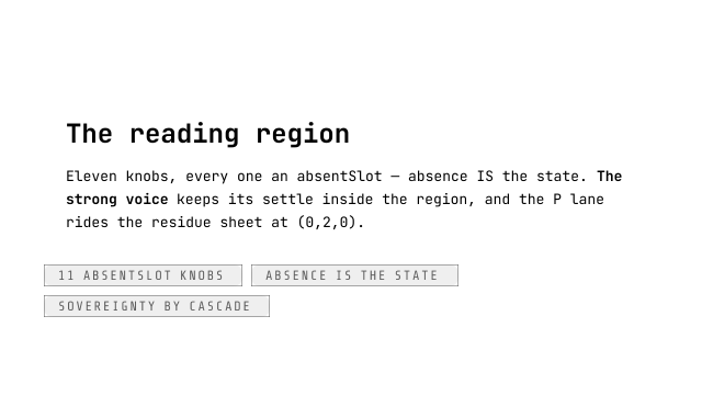
The reading region provider: <Prose size leading family ink gradient ground align indent initialLetter wrap hyphens> renders div.jx-pure[data-jx-prose] — NOT <Typography>, that word is markdown's live user-facing vocabulary (<Markdown typography="relaxed">); two concepts under one name is documentation debt forever. The provider resolves the ELEVEN frozen v1 knobs through ProseDefaults (every one an absentSlot — ABSENCE IS THE STATE: an unset knob emits nothing, stamps nothing, and the ambient channel — an outer prose region's declarations/vars, or no opinion at all — keeps flowing; nested regions inherit every knob they do not set, nearest setter wins) and applies the plugin chain AT THE PROVIDER (applyTypoScope, read inside the $derived so medium-gated filters re-run; a print-medium plugin can strip gradient/ground before CSS sees them) before the PURE resolver emits the two channels: declarations (the inheritance lane — font-size/family/color/text-align/text-wrap/hyphens/background-color) + the --jx-ty-* var mirrors (documented for app-side css reads) + presence hooks (data-jx-ty-leading/-indent/-initial, data-jx-ty-ink="gradient" — presence-gated because an ungated var(--jx-ty-leading, inherit) rule at (0,2,0) would fire always and break the face's p{1.6} for every non-prose region). The element lanes live in prose.css, the scope-owned residue sheet, every rule at (0,2,0): the leading un-short-circuit generalization and the indent lane (P-only — headings never inherit a first-line indent), the drop cap in BOTH arms (@supports initial-letter modern path + the float ::first-letter fallback — a browser-class-dependent drop cap reads as a bug; suppresses indent on the same P; keeps printing on paper, the manuscript posture), and the FILL-ONLY gradient lane (background-clip:text + -webkit-text-fill-color, NEVER color:transparent — currentcolor on a mark would resolve to the inherited transparent and vanish; marks restore solid by element rule; --jx-ty-ink carries only color tokens so Heading's var-fallback utility never sees an invalid-at-computed-value-time var; --jx-ty-ink-solid ships for plugin and print reads; @media print and forced-colors restores live in the same sheet — the paged.js clone never re-runs the provider). SOVEREIGNTY by cascade, zero JS masking: every residue rule beats the face element rules and LOSES to the markdown sheet's §2a (0,2,1) inside [data-jx-markdown] — an outer <Prose size leading> can never fight <Markdown typography=…>; ink/flow knobs pass through; chrome stays unaffected BY CASCADE (element-level declarations beat an inherited wrapper color); code/kbd stay mono under family (face B1 element rules); prose stamps no density (the trio's own naming argument). The context pair ships in the typography lib (provideTypography/getTypographyScope, getter-endorsed — a provider flip re-derives future consumers in the same frame).
ui
tree-view
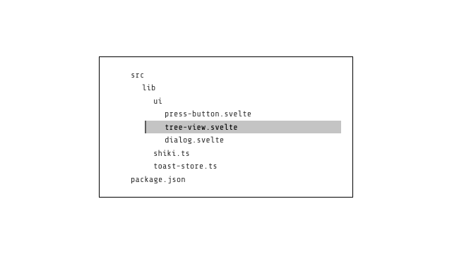
NativeHTML ARIA tree (ul[role=tree] with roving tabindex, arrow-key contract): directory nodes with collapsible arrows (150ms rotate), leaf nodes with language-colored status dots, selected state with terminal-hover bg + primary left border. Builds from flat file paths automatically. Full keyboard: up/down/rightarrow/leftarrow/Enter.
ui
component-canvas
The component documentation workbench: header (title + description + GitHub Source link), LIVE demo stage (children snippet on muted surface, always full-width), a floating Playground dock (collapsible + horizontally draggable controls panel over the stage's top-right corner — consumer snippet or schema-lowered rows inside one integrated ItemGroup), and a collapsible code drawer (TreeView file sidebar + CodeCard embedded). Files from a flat path list auto-build the tree.
ui
badge
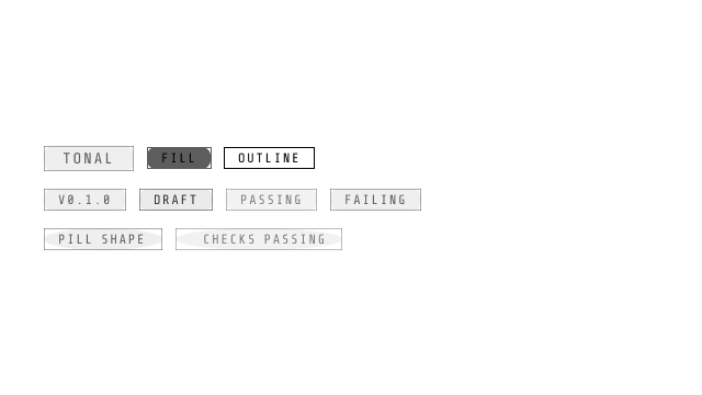
The inline status chip of the site grammar: Share Tech Mono uppercase micro-label, 1px border, kbd-law geometry (height from the secondary line, no block padding). Variant grammar: fill | tonal | outline (default tonal — the bare Badge is the brand primary tint, no local hue override); status hues inject --jx-tonal through a class utility (neutral / error / success).
ui
avatar
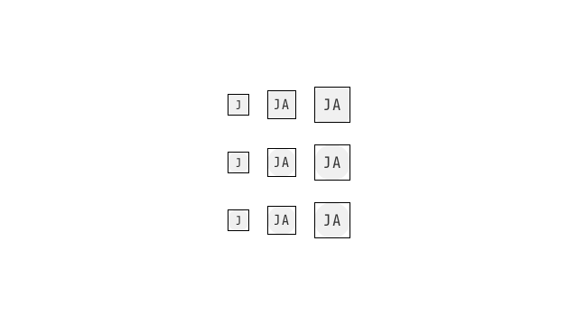
NativeHTML <img> — lazy, async-decoded, intrinsic width/height so layout never shifts. Failed or missing src falls back to an initials block derived code-point-wise from name (CJK-safe: 张伟 stays 张伟); at sm (24px) the block halves to one code point so it never overflows or wraps. Three silhouettes via variant: bevel (default — corner-shape: bevel with var(--radius) scaled proportionally to the size, 6/8/10px, square where unsupported), rounded (corner-shape: round + border-radius: 50% circle) and squircle (corner-shape: squircle + 50% superellipse, degrading to the circle). The full name rides a tooltip by default (tooltip={false} opts out). alt defaults to name; pass alt="" for decorative avatars beside a visible name.
ui
accordion
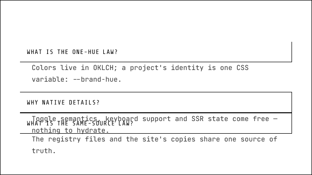
W3C-first: the accordion IS <details>/<summary> — native toggle semantics, keyboard support and SSR state, nothing to hydrate. The group adds border collapse (one 1px frame, 1px seams) and opt-in exclusive mode (capture-phase toggle guard; also governs raw <details> children). Height animation is progressive enhancement via interpolate-size + ::details-content; unsupported engines snap natively.
ui
carousel
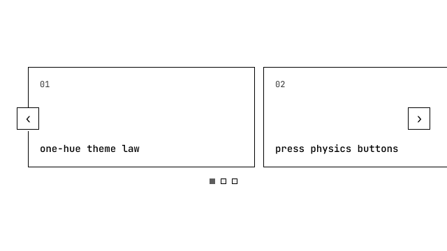
W3C-first: a carousel IS a scrolled region — CSS scroll-snap does the paging, native scrolling does the motion (momentum, keyboard when focused). JS only READS the position (rAF-throttled) to keep the dots honest. No slide cloning, no virtual window: slides are ordinary direct children of the track. Dots page; arrows page; the active dot follows the nearest snap slide.
ui
empty
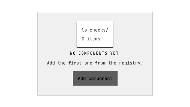
The no-data state of the eight-state machine — nothing more (error/loading/404 are alert/result surfaces). A figure: terminal illustration slot (default: the empty directory listing), title, description, actions snippet. Pure composition, zero JS.
ui
descriptions
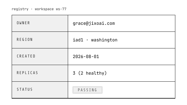
The enterprise detail view as a composed dl: Descriptions (columns/bordered HOW-props) + DescriptionsItem (term → dt, children → dd — rich cells are just children; childless items render the em dash).
ui
statistic
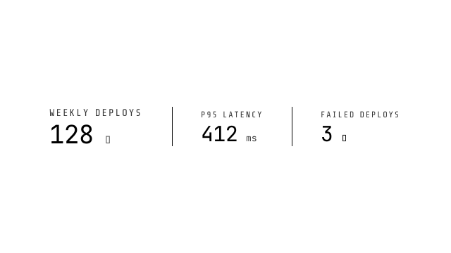
The metric readout: micro-label over a big tabular-nums value with prefix/suffix snippets and a text-glyph trend (▲ primary / ▼ destructive). The component never guesses what 'good' means for your metric — compose your own semantics through the snippets.
ui
timeline
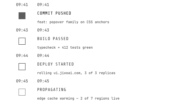
The activity stream with a DRAWN spine: a one-cell grid host stacks the semantic ol over one whole-list SVG spine layer measured from the live geometry (grid-area 1/1 sibling, source-order under the items, pointer-transparent, zero abspos) — connectors as dot-edge-to-dot-edge subpaths of one path element (the axis never crosses a dot, Owner r3), dashed as real stroke-dasharray phase-anchored to the node's flow-end edge, beam as a traveling gradient stroke with actual width, scroll-progress as a stroke-dashoffset draw. axis/direction/interlacing/RTL resolve in one coordinate space; a no-JS per-item CSS floor upgrades to the measured spine on hydration. The spine prop takes 'plain' | 'dashed' | 'beam' or a custom snippet receiving the geometry payload (the line(i) seam and the line-preset components retired, breaking).
ui
image
The general-purpose picture on avatar's proven laws: native <img>, lazy, async-decoded, REQUIRED intrinsic width/height (the no-CLS contract), alt semantics (text by default, '' opts decorative), and a failure fallback with src-change reset + composed onerror. Lightbox/preview is deliberately a dialog recipe, not built in.

ui
badge-indicator
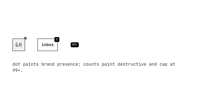
antd Badge's live half — the count/dot overlay riding a corner of its child (avatar, icon, tab): dot is presence without a number; count caps at overflow (99+ default); count=0 hides honestly (zero unread IS no badge) unless showZero. Standalone (no children) renders an inline chip.
ui
highlight-detect-default
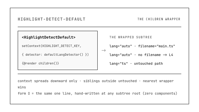
The DLD context provider as a ~10-line CHILDREN WRAPPER (highlight-lang-detector D2.2 form ① — its implementation IS the hand-written form ②): one setContext at init makes defaultLangDetector() the detection default for every <CodeCard lang='auto'> in the wrapped subtree, while the langDetector prop and backend.detector keep their ring priority (prop → context → backend → runtime reject). Svelte context propagates downward ONLY — sibling subtrees outside the wrapper are untouched, and nested wrappers take the nearest. Zero styling and zero behavior beyond the wiring; consumers wanting zero components hand-write the form ② setContext line instead (the DLD lib item stays framework-free by law — no Svelte rides a registry:lib item).
ui
scroll-virtual
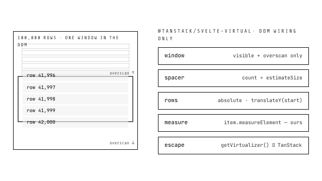
Virtual scrolling for the scroll-area family — STRONGLY associated with @tanstack/svelte-virtual (the official Svelte 5 adapter over @tanstack/virtual-core) with deliberately THIN coupling: windowing semantics, dynamic measurement, scrollToIndex/scrollToOffset, lanes, getItemKey are all TanStack's; read TanStack Virtual's docs directly. This component adds only the DOM wiring: composes scroll-area (label passthrough — the variant prop retired with the 2026-09-15 family rework: the composed area is always hand-drawn; the platform path is native-scroll-area), owns the positioning layer (totalSize spacer + absolutely positioned rows), and calls item.measureElement on its own row wrappers so dynamic heights work out of the box. Opt-in by design — scroll-area alone has ZERO TanStack dependency.
ui
chart
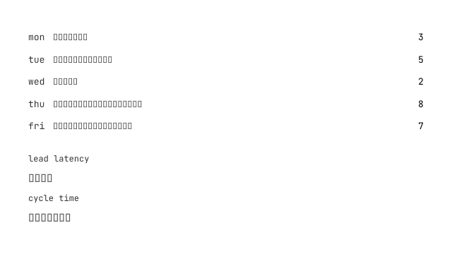
Terminal-native charts, zero runtime dependencies: horizontal block-glyph bars on the mono text grid (label + value lanes, fill/tonal/outline ink), one-line sparklines (block or braille cells), an SVG polyline over hairline grid rules (optional 12% tonal area, non-scaling round markers, axes as authored snippet slots — never guessed), and a stroke-dasharray donut ring in the --chart-1..5 semantic palette with a neutral brand-hue oklch ladder. Deterministic display primitives: every degenerate input (empty, all-negative, constant, NaN, zero-total) has a frozen, unit-tested output; each part is role=img with a REQUIRED label and an opt-in visually-hidden data table fallback. The glyph math exports from the folder for tests; the Chart root only shares a density tier.
ui
math-block
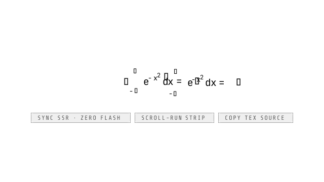
The display math surface: a native <figure> (figure semantics kept) framing a wide-equation strip that rides the SHARED scroll-run contract wholesale — createScrollStamp's verdict (data-jx-scroll-state none|start-closed|end-closed|open) gates ScrollChrome's shadow veil and nudge chips, so a formula that fits paints no chrome — with real KaTeX markup rendered SYNCHRONOUSLY during SSR/prerender (the isomorphic-small lane: true zero flash, zero CLS, print-freeze-safe markup — NOT code-card's floor-then-upgrade), a copy control carrying the raw TeX source (press physics, clipboard fallback, labels localization payload), and errors painted IN PLACE (the errorColor token run inside the same box, one console.warn diagnostic; a caller-forced throw degrades to the raw source — errors never escape a component boundary).
ui
mermaid
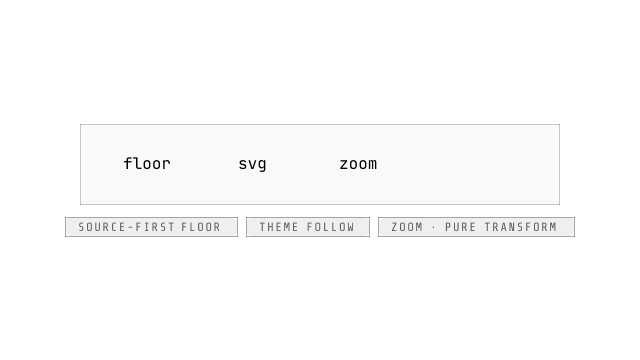
The diagram surface under the code-card progressive-enhancement law: prerender paints the escaped diagram source as a readable zero-JS floor, hydration lazy-loads the engine (the mermaid-engine singleton, ~1MB code-split) and swaps in the sanitized SVG with a reduced-motion-respecting fade over a min-height reserve (--jx-mermaid-floor-min, consumer-tunable). Theme follows the flip AUTOMATICALLY: the surface passes its own figure as the engine's themeRoot (scoped containers resolve THEIR tokens) and an effective-scope observer re-renders on any ancestor theme change — explicit 'light'/'dark' pins read the target sheet through a local wrapper. When the effective theme resolves DARK and backdrop is on (the default), the viewport paints the designed zero-ink veil — a subtractive backdrop-filter chain (blur/contrast/brightness/saturate) over the page behind, computed background transparent, carrying the card dialect's radius, inner padding and a 1px token-law border — while the derived dark palette lifts its node fills toward white through the palette's own tokens for graphics contrast on the veil ground; backdrop={false} opts out (transparent as light mode) and where backdrop-filter is unsupported the component's own opaque theme ground returns (the standing surface-ground floor). Light themes never paint a veil. Zoom (±0.25 steps, clamp 0.5–3, reset) is a pure transform with the viewport as the two-axis pan surface — the recorded scroll-run exemption (thin token scrollbars both axes, NO shared chrome inside), plus a copy-source control with the labels localization payload. A parse failure paints the error summary strip and KEEPS the source floor standing.
Feedback
ui
skeleton
The loading placeholder block: muted surface with a terminal brightness pulse, aria-hidden, pure CSS. Geometry (width/height/aspect) comes from the class prop or the parent layout; prefers-reduced-motion freezes the pulse. The loading-region a11y contract (aria-busy / live region) belongs to the container, not each block.

ui
alert
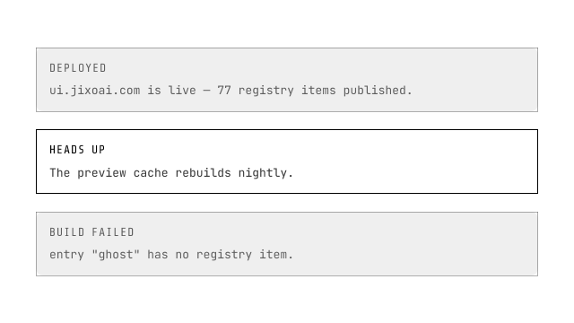
The inline notice block (not the modal system-dialog): 1px border, hard offset shadow-2xs, variant ladder as the surface (outline transparent ground + --jx-outline border; tonal 12% tinted ground + 45% border + tonal title ink). Live-region semantics are a prop — assertive=false → role=status (polite, default), assertive=true → role=alert. Hue is injection: --jx-tonal defaults to the brand hue; failed statuses inject --error (a status, never the destructive action hue).
ui
progress
W3C-first: progress IS the native <progress> element — role, value semantics and the indeterminate state are the browser's. The component adds the jixoai paint (1px frame, brand fill, terminal stripe sweep when indeterminate) and an optional label + polite % readout.
ui
spin
The loading indicator, ora's voice: one spinner name lane over two corpora — the generated svg artifact (@jixoai/spin-set, blocks-wave default) FIRST, the 60-name cli-spinners text catalog second (an artifact spinner named like a text one overrides it — explicit config beats built-ins, the icons law). role=status (polite by construction). Bare = inline glyph (text frames or the svg loader); wrapping = aria-busy container where the scrim OWNS pointer events (never a visual mask with live hit areas beneath — loading and disabled are different states).
ui
result
The page-level outcome of an operation — deliberately THIN: status glyph + title + description + actions, no 403/404 routing logic, no illustration system (bring your own icon snippet). Success paints through the brand voice (no green in this language); error destructive. empty ≠ result: no-data vs operation-outcome stay different components.
Effects
ui
press-button
The press-law button (theme .jx-press): hover grows the shadow only (xs → sm, the body never moves); active presses the body +1px into the page while the box-shadow offsets counter-shrink 1px (the *-press token poses) — the shadow paint stays anchored, no pseudo layer. Variant ladder: fill / tonal / outline (default) / ghost + link (an interaction-affordance exception, not a surface rung); hue is injection through --jx-fill/--jx-fill-ink/--jx-tonal/--jx-outline (destructive ACTIONS inject the destructive pair, copied-style feedback = tonal + success). One opt-in effect loop per button via typed builders exported from the module script — shimmer() additive perimeter spark (plus-lighter, box-owned clip), pulse() sonar rings (slow/ring/ripple), rainbow() blended aurora wash (conic, three prime timelines, screen on fill / color elsewhere), ripple() press-point ink driven by WAAPI and removed on animation.finished (runtime extracted to ripple.svelte.ts, shared with Chip), with a round/bevel-diamond shape option — modeled on the animation-svelte reference, options on every loop, frozen under reduced motion.
ui
glass
The ONE glass-effect system (Owner 2026-09-08 「把 glass 和 blur 合并成一个 blur…引入 Liquid Glass」; r10 2026-09-09 the kube.io SOURCE-LEVEL lock): the five retired hand-tuned glass paints unify into ONE typed effect family behind the data-jx-effect='blur'|'liquid-glass' stamp channel. TWO API LAYERS: blur({radius, saturate, fill, brightness}) the zero-JS frost member — css-only, the law sheet's UNCONDITIONAL base paint every engine gets; liquid({...}) the PHYSICAL liquid member — kube.io's generator ported line-level from their shipped bundle (four dome surfaces convex-circle/convex-squircle/concave/lip, the ray-traced profile WITH the glass-slab path term d = T.x/T.y·(H·thickness+bezel), ÷maximumDisplacement-normalized border-swept maps at 2× dpr under the 512² raster cap, the 9-primitive SVG chain in their verbatim order — in-chain frost → feDisplacementMap → rim saturate → the saturated-copy/ring-alpha specular pair); liquid.apple({variant, tint, interactive, shape, isEnabled}) the SEMANTIC layer — SwiftUI glassEffect's standard compiled DOWN into the physical layer (variant regular/clear/identity; tint → a 30% color-mix fill; interactive stamps --jx-glass-interactive:1 for the law's press motion; shape 'capsule'|px overrides the mount radius; isEnabled false or identity → the FROST member, zero lens cost). glass.css is the law sheet (scroll-run posture): the frost base paints unconditionally — liquid's no-JS / no-url()-engines fallback, the retired .jx-glass values verbatim; the @supports (backdrop-filter: url()) branch is POINTER-ONLY for liquid (the mount appends the filter node THEN writes --jx-glass-filter — frost lives INSIDE the chain, a css frost chain under url() would double-blur; blur() never enters the branch); print drops the filters (fill stays); prefers-reduced-transparency paints solid; NO forced-colors block (consumers carry their Canvas grounds). liquid-glass.svelte.ts: liquidGlass(fx) the attachment FACTORY (the {@attach} face, effect-attachments 2026-09-09) over attachLiquidGlass(el, fx) — mount stamps vars → measures (shape override ?? border-radius) → canvas-encodes both maps → appends the zero-size host svg + the chain at element size → writes the pointer LAST; ResizeObserver rAF-coalesced regeneration; the no-canvas (jsdom/ancient) and zero-box guards leave frost standing, no crash. glass-map.ts is the pure core (zero DOM, node-testable). Consumers keep ONLY their element chrome (tint fill, shadow, border-radius) — the kube recipe, documented on the page.