registry:ui · Data Entry
Data Entry forms — the family hub
The form family names its components after the elements they are, and each now owns a canonical page. The native control is the contract: every input type passes through untouched, and the only repaint is the shell — border, background, the inset focus outline. The selectors redraw their own paint in pure CSS (checkbox, radio, toggle strip appearance and draw their glyphs with pseudo-elements while the native input keeps every behavior). The select family splits in two — NativeSelect keeps the platform popup, Select builds a popover listbox — and the two controls the platform cannot paint our way split out as full customs: range (the fully custom slider) and color-picker (the oklch-hub popover). This hub keeps the tour; the depth lives one hop away.
Native lanes & full customs
The native control is the contract: input passes every native type through untouched (only the shell repaints), number-input adds the [- NUM +] stepper, and the controls the platform cannot paint our way are full customs — range (the pointer-events slider), color-picker (the oklch-hub popover), date-picker (the zero-dep calendar), combobox and tags-input (the searchable pair), and file-input (the professional file picker).
ui
input
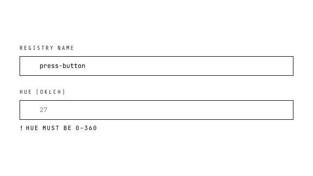
NativeHTML input: every native type passes through. Text-like types get the jixoai shell (1px border, radius 0, hover lift, inset focus ring) with the Tier-1 lane (.jx-input-lane) inside; range is the Tier-1 pure-CSS slider (.jx-range); color is the Tier-1 color field (.jx-color-field wrapper, locked square swatch, pipette glyph); date/time/number lanes restyle the platform's picker indicator and spinners via the same sheet. checkbox/radio/toggle/file have their own components (the bare types still pass through). Optional label[for], error wiring (aria-invalid + aria-describedby, monochrome dashed ! message), clearable ×, four snippet slots. value is $bindable: bound = controlled, absent = purely uncontrolled (FormData/form.reset untouched).
ui
number-input
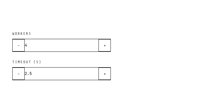
[- NUM +] stepper: 28px square buttons (press physics, font-nav bold characters), centered chromeless input on the Tier-1 .jx-input-lane (placeholder distinction + spinner law live in the jx-pure sheet (Part A)), click + long-press (300ms→100ms) acceleration, min/max clamp, RTL-aware logical properties.
ui
range
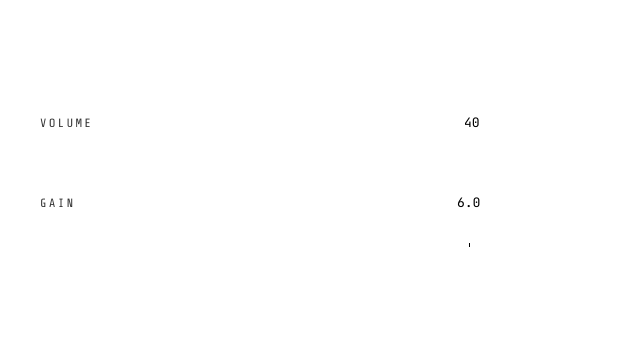
The native slider, semantic surface: a REAL input[type=range] as the base (2026-09-01 native rebase — jx-pure is the foundation; the registry version adds slots and semantics, never re-draws the control). The platform owns pointer, keyboard (arrows/Home/End/PageUp/Down), RTL, the label[for] binding and form submission (name= rides the input own FormData lane); the component adds the label row, the step-precision value readout, the optional tick ruler (one mark per step, inset to the thumb's travel; click a mark to snap, the wheel fine-tunes one input-step per detent behind a declarative touch-action axis grammar (wheel: true | 'x' | 'y' | 'xy' | 'none' | { x?, y? } with per-detent multipliers — owned gestures are swallowed and default-prevented, the page never scrolls under the slider), the ruler composes declaratively through RangeTick scales (marks at scale × step periods, lengths grading ascending by value), the vertical orientation face (orient attribute + writing-mode: min at the physical bottom, geometry on the width axis, the ruler maps bottom-up), the family error law (aria-invalid + aria-describedby + dashed-ring thumb), density tiers and external-write snapping. Paint is the jx-pure range recipe verbatim on the component hook — one visual law, two mounting surfaces.
ui
date-picker
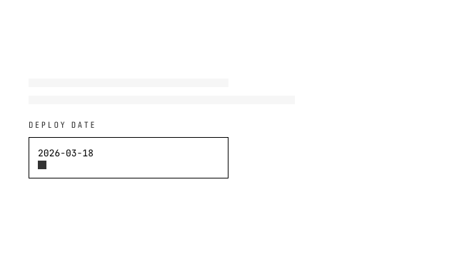
Form wave 2 — calendar popover over hand-rolled Date math (zero date libraries): single ISO string or {start,end} range with anchor/swap semantics, Monday-first grid, strict ISO parse/format/compare. Popover API panel (popover=auto + popovertarget) CSS-anchored under a select-style trigger; light dismiss/Escape/top-layer are native. Floating-surface law: ::after shadow layer (semi-transparent black/white) + @starting-style entry; variant='solid' | 'acrylic' | 'auto' (acrylic falls back to solid under prefers-reduced-transparency; the terminal bezel keeps its identity through the jx-surface fill props).
ui
color-picker
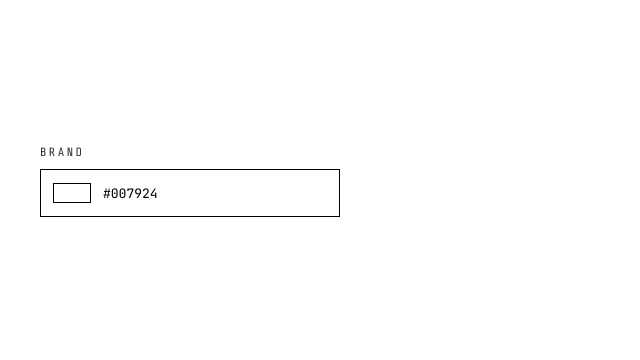
Color picking on NATIVE controls (2026-09-01 rebase — jx-pure is the foundation; the registry surface adds slots and semantics, never re-drawn inputs): the value field is a real input[type=text] (label[for], name= rides its own FormData lane, native focus/selection/disabled) and the swatch is a real input[type=color] that opens the engine picker; the chevron opens the pro popover editor — SV pad + hue bar (custom 2D picker surfaces, the legitimacy class of date-picker's calendar), hex/hsl/oklch switching with OKLCH as the conversion hub, invalid-draft revert, Eye Dropper API. One truth: every surface flows through the bindable value string.
ui
combobox
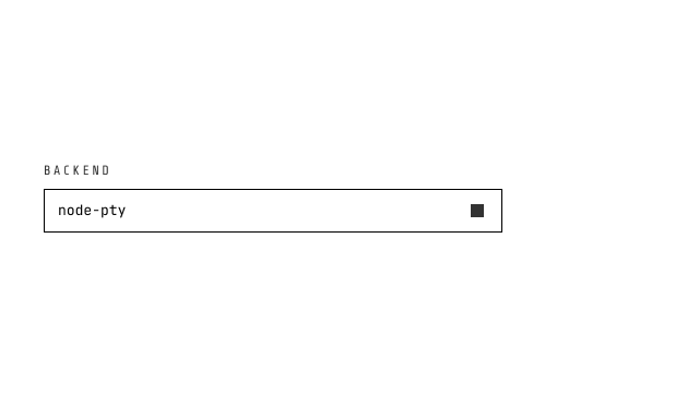
Searchable select with custom-value input: real-time label filtering, allowCustom for free-text values, popover panel with roving aria-activedescendant (focus stays in input), 'No results' + 'Use xxx' affordance, blur-commit, family label/error contract. name= is intercepted off the native input and submits the committed VALUE (option value or custom string — never the display label) through the faceless form-field bridge. Floating-surface law: ::after shadow layer (semi-transparent black/white) + @starting-style entry; variant='solid' | 'acrylic' | 'auto' (acrylic falls back to solid under prefers-reduced-transparency; the terminal bezel keeps its identity through the jx-surface fill props).
ui
tags-input
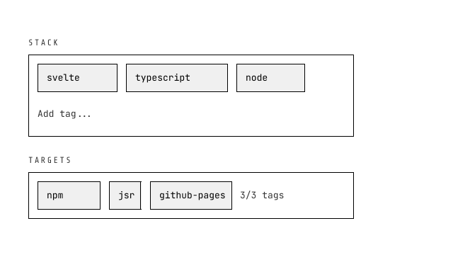
Input + multiselect hybrid: flex-wrap tag chips with press-physics removal, Enter/comma/Tab/paste-split to add, Backspace removes last, suggestions popover with filtering, maxTags limit, duplicate flash, $bindable Tag[]. name= submits the tag VALUES as one JSON array string (empty set contributes nothing) through the faceless form-field bridge. Floating-surface law: ::after shadow layer (semi-transparent black/white) + @starting-style entry; variant='solid' | 'acrylic' | 'auto' (acrylic falls back to solid under prefers-reduced-transparency; the terminal bezel keeps its identity through the jx-surface fill props).
ui
file-input
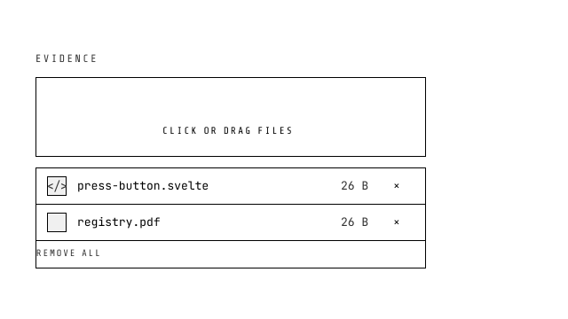
The file picker that reads like one (2026-08-23 redesign, ant-design Upload anatomy with local-picker semantics): drop (default) renders a dashed drop zone — upload glyph, font-nav CLICK OR DRAG FILES, composed accept/max hint, drag-over swaps the dash to primary with lift physics — button renders the compact inline trigger; both are keyboard buttons over a visually hidden native input AND real drop targets (enter-depth counting, accept gate-rejection reported via the error line + onreject). Selected files render as ant-style rows in one bordered box: square thumb (image object-URL preview or kind glyph), ellipsized name + title, size, remove ×, remove-all tail. File[] $bindable contract, sm/md/lg sizing, maxFiles overflow merged into the error line (never truncates), InputGroup overflow hardening (min-width 0, max-width 100%).
The select family & the multiline shell
The select family splits in two: native-select keeps the platform popup (a real name/value pair in FormData, the OS overlay picker on touch) while select builds a popover listbox with per-option descriptions and roving ↑/↓/Enter highlight — reach for the rich one only when the native popup can’t say what you need. textarea is the same text-shell law as input, taller, resize locked to the vertical axis.
ui
native-select
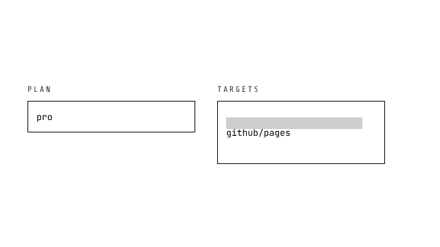
The original native <select> with appearance-none and self-drawn chevron — recommended for simple forms, mobile native overlay picker, and FormData submission. Multiple mode with listbox geometry.
ui
select
Custom select built on the native Popover API + CSS Anchor Positioning: popover='auto' light-dismiss panel, listbox role with roving aria-activedescendant (↑↓/Home/End/Enter), terminal bezel styling with primary left-border selected state, RTL-aware. name= submits the committed VALUE into FormData through the faceless form-field bridge (ElementInternals); for the platform's own overlay picker use native-select instead. Floating-surface law: ::after shadow layer (semi-transparent black/white) + @starting-style entry; variant='solid' | 'acrylic' | 'auto' (acrylic falls back to solid under prefers-reduced-transparency; the terminal bezel keeps its identity through the jx-surface fill props).
ui
textarea
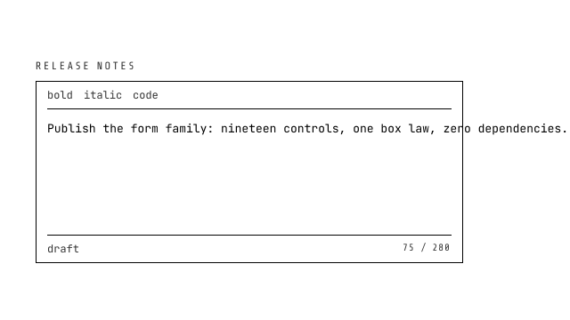
NativeHTML textarea with the jixoai text shell; rows pass-through (default 4), resize: vertical. Same label/error contract as input.
The pure-CSS selectors
Three controls where the paint deserved its own drawing code: checkbox, radio, and toggle strip appearance and draw their glyphs with pseudo-elements — a clip-path check, a scaled dot, a sliding knob — while the native input keeps form participation, keyboard toggling, and :checked/:indeterminate state. Zero icon fonts, zero SVG; compose them into forms with the family’s uncontrolled FormData flow (the old example-form story lives on each child page).
ui
checkbox
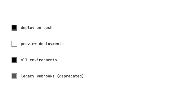
Pure-CSS checkbox: appearance-none + 16px square + 1px border, :checked fills primary with a white checkmark (clip-path polygon, zero icon deps), :indeterminate morphs to a horizontal bar, error wiring (aria-invalid + describedby + dashed border + monochrome ! message). Label on inline-start.
ui
radio
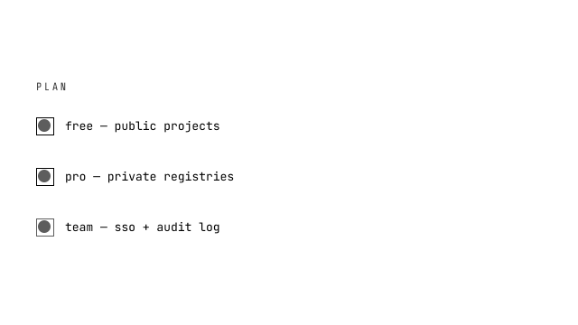
Pure-CSS radio: appearance-none + 16px circle, :checked border primary + inner 8px dot (scale 0→1 transition), error wiring identical to checkbox.
ui
toggle
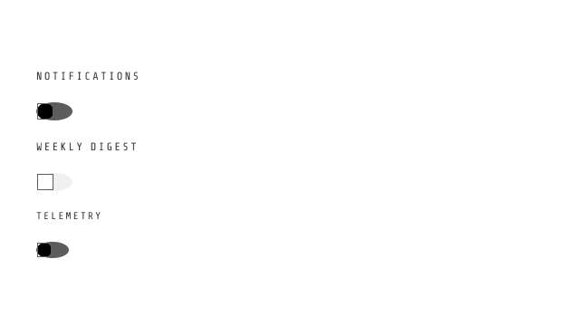
Native checkbox painted as a switch: ONE element — the input is the rail (the standard layer's jx-html-switch utility draws the capsule and its ::before knob). Rail geometry rides the density lanes (xs 32×16 · sm 36×18 · default 40×20 · lg 48×24); checked slides the knob by width − track and flips it to primary-foreground over 200ms cubic-bezier; checked = $bindable; the label renders as a sibling label[for].
density
form controls across the density ladder
The same native control keeps its semantics while the inherited density scope changes its footprint. Each row is a real clickable control for physical hit-target probes.
form · density ladder
<script lang="ts">
  import Input from '@ui/input.svelte';
</script>

<!-- each column re-scopes the density scope through data-density-scope -->
<div class="grid gap-4 min-[760px]:grid-cols-5">
  {#each ['2xs', 'xs', 'sm', 'default', 'lg'] as density}
    <div data-density={density} data-density-scope={density} class="flex min-w-0 flex-col gap-[var(--jx-gap)]">
      <span class="font-nav text-[length:var(--jx-text-secondary)] uppercase tracking-[0.14em]">{density}</span>
      <Input label={`${density} input`} placeholder="click target" />
    </div>
  {/each}
</div>
law
the NativeHTML base
Why the family is named after the elements: the component adds semantics and paint, never a second control. Three rules carry the whole base.
1 · native type passthrough — the type prop IS the native type
No
TextField/NumberFieldforks:typelands on the element verbatim (text/password/ email/ number/ search/ url/ tel/ date/ time/ file/ hidden…), and every other attribute (placeholder, min/max/step, accept, autocomplete…) rides through restProps. If the platform grows a new type tomorrow, this component already supports it. 2 · repaint strategy — keep the input, redraw the paint
The split happens at the paint, never the control. checkbox / radio / toggle set
appearance: noneand draw their own glyphs with pseudo-elements — a clip-path check, a scaled dot, a sliding knob — while the native input underneath still owns state, keyboard toggling, and FormData. The remaining platform widgets are repainted by the Tier-1 class vocabulary (jx-pure Part A):rangebecomes the pure-CSS slider (the zero-JS cqw shadow fill, ringed disc thumb), color becomes the swatch-plus-pipette field, and the date/time/number lanes restyle the platform's own picker indicator and spinners; file and dates have their own professional controls — file-input (drop zone, thumbnail rows, maxFiles) and date-picker (a zero-dep calendar popover) — while their bare native types still pass through this component.3 · label / error wiring — label[for] + aria-describedby
The
labelprop renderslabel[for]against an auto-generated id ($props.id(), override withid). Theerrorprop renders the “! message” line, links it witharia-describedby, setsaria-invalid, and dashes the shell border. Screen readers announce the error when the control is focused — no extra wiring owed.
<script lang="ts">
  import Input from '@ui/input.svelte';
  import Checkbox from '@ui/checkbox.svelte';
  import Radio from '@ui/radio.svelte';
  import Toggle from '@ui/toggle.svelte';
  import NativeSelect from '@ui/native-select.svelte';
  import Select from '@ui/select.svelte';
  import NumberInput from '@ui/number-input.svelte';
  import Textarea from '@ui/textarea.svelte';
  import FileInput from '@ui/file-input.svelte';
  import DatePicker from '@ui/date-picker.svelte';
  import Range from '@ui/range.svelte';
  import ColorPicker from '@ui/color-picker.svelte';
  import Combobox from '@ui/combobox.svelte';
  import TagsInput from '@ui/tags-input.svelte';
</script>

<!-- every native type passes straight through -->
<Input type="email" label="email" placeholder="you@host.tld" required />
<Input type="range" label="volume" min="0" max="100" />

<!-- pure-CSS selectors (appearance-none + pseudo-element glyphs) -->
<Checkbox label="subscribe" labelSide="left" />
<Radio label="pro" name="plan" />
<Toggle label="notifications" bind:checked />

<!-- the select split: NativeSelect (FormData pair) vs Select (popover) -->
<NativeSelect label="plan" name="plan">
  <option value="free">free</option>
</NativeSelect>

<!-- the customs: stepper, files, dates, slider, oklch picker, search -->
<NumberInput label="workers" bind:value={workers} min={1} max={16} />
<Range label="volume" bind:value={volume} min={0} max={100} />
types
Types
The family splits by how far the paint strays from the platform: passthrough lanes, the select fork, and the pure-CSS selectors.
input (every native type), number-input (stepper), range, date-picker, color-picker, combobox, tags-input, file-input.
native-select keeps the platform popup; select builds a popover listbox; textarea is the taller text shell.
checkbox, radio, toggle — appearance: none + pseudo-element glyphs, native state kept.
usage
Usage
Compose uncontrolled fields into a form; read FormData once at submit — no per-field state owed.
<script lang="ts">
  import Input from '@ui/input.svelte';
  import Checkbox from '@ui/checkbox.svelte';
  import Radio from '@ui/radio.svelte';
  import Toggle from '@ui/toggle.svelte';
  import NativeSelect from '@ui/native-select.svelte';
  import Select from '@ui/select.svelte';
  import NumberInput from '@ui/number-input.svelte';
  import Textarea from '@ui/textarea.svelte';
  import FileInput from '@ui/file-input.svelte';
  import DatePicker from '@ui/date-picker.svelte';
  import Range from '@ui/range.svelte';
  import ColorPicker from '@ui/color-picker.svelte';
  import Combobox from '@ui/combobox.svelte';
  import TagsInput from '@ui/tags-input.svelte';
</script>

<!-- every native type passes straight through -->
<Input type="email" label="email" placeholder="you@host.tld" required />
<Input type="range" label="volume" min="0" max="100" />

<!-- pure-CSS selectors (appearance-none + pseudo-element glyphs) -->
<Checkbox label="subscribe" labelSide="left" />
<Radio label="pro" name="plan" />
<Toggle label="notifications" bind:checked />

<!-- the select split: NativeSelect (FormData pair) vs Select (popover) -->
<NativeSelect label="plan" name="plan">
  <option value="free">free</option>
</NativeSelect>

<!-- the customs: stepper, files, dates, slider, oklch picker, search -->
<NumberInput label="workers" bind:value={workers} min={1} max={16} />
<Range label="volume" bind:value={volume} min={0} max={100} />
a11y
Accessibility
Every member keeps the native control's semantics; the family contract wires labels and validation text once.
Keyboard
| Key | Action |
|---|---|
| Tab | Moves focus field to field in DOM order — native elements, native order |
| native keys | Each member keeps its control keys: Space toggles selectors, ↑/↓ steppers and listboxes, Enter submits |
ARIA
| Attribute | Value | Description |
|---|---|---|
| label[for] | {id} | The label prop renders a programmatic label against the auto-generated id |
| aria-invalid | true | Set by the error prop on every member |
| aria-describedby | {id}-error | Links the "! message" line so readers announce it on focus |
theming
Density and tokens
One density rhythm across every field shell: hit target, text size, and leading scale together (see the density-ladder section above).
| Token | Default | Source |
|---|---|---|
| --jx-hit | field height, scope-scaled | density |
| --jx-text | 10 / 11 / 12 / 13 / 15px | density |
| --jx-leading | line-height, scope-scaled | density |
api
API
The hub documents the shared field contract (Input's shell, the canonical member); each child page carries its full interface.
Properties
| Property | Type | Default | Description |
|---|---|---|---|
| type | string | 'text' | Any native input type — lands on the element verbatim. |
| label | string | — | Field label; renders label[for] above the control. |
| id | string | auto | Wired into label[for] / error[id]; auto-generated when omitted. |
| error | string | — | Error text → aria-invalid + aria-describedby + dashed border. |
| clearable | boolean | false | Text-like only: × button in the inner-inline-end area. |
| innerInlineStart | Snippet | — | Inside the shell, left of the input (prefix icon / unit). |
| innerInlineEnd | Snippet | — | Inside the shell, right of the input (suffix / unit / action). |
| outerBlockStart | Snippet | — | Outside the shell, above — replaces the label prop when given. |
| outerBlockEnd | Snippet | — | Outside the shell, below — renders below the error line. |
value bind | string | number | — | Bound ⇒ controlled, absent ⇒ purely uncontrolled. |
Universal props
| Property | Type | Default | Description |
|---|---|---|---|
| size | 'small' | 'medium' | 'large' | 'auto' | number | 'auto' · ambient scope | the base scale — root font-size; parts size in em |
| shape | 'round' | 'scoop' | 'bevel' | 'notch' | 'square' | 'squircle' | 'auto' | 'auto' · ambient scope | corner geometry (CSS corner-shape; §14 degrade table) |
| radius | 'small' | 'medium' | 'large' | 'auto' | number | 'auto' · ambient scope | corner size; auto = the concentric broadcast (§3) |
| density | 'small' | 'medium' | 'large' | 'auto' | number | 'auto' · ambient scope | spacing/leading scale over the kernel channels (§4) |
| color | 'primary' | 'secondary' | 'error' | 'warn' | 'success' | 'info' | 'auto' | number | string | 'auto' · ambient scope | the hue axis of the fixed oklch primary system (§5) |
| theme | 'light' | 'dark' | 'system' | 'auto' | 'auto' · ambient scope | light/dark profile; system = the JS-mutable global (§6) |
| elevation | 'level-1' | 'level0' | 'level1' | 'level2' | 'level3' | 'level4' | 'level5' | 'auto' | number | 'auto' · ambient scope | official M3 levels over the surface ladder (§7) |
| motion | 'reduced' | 'subtle' | 'normal' | 'expressive' | 'auto' | number | 'auto' · ambient scope | intensity across the motion kernels (§8) |